Deutsch
 EN
EN Español
 Français
 Italiano
 Português
Designing memorable newsletters can be draining when you lack inspiration. 😔 At the same time, you can’t risk sending dull Cyber Monday emails that don’t stand a chance at getting opened.
Come holiday season, your subscribers’ inboxes will be flooded with 100s of emails, each competing for their attention. Your challenge: design a campaign that stands out from the rest.
To fuel your creativity, we’ve put together six emails you can use as inspiration to impress your audience. But before you get the goods, here’s a checklist to make sure you set yourself up for the best Cyber Monday campaign possible. 💪
A Winning Checklist for Black Friday Cyber Monday Campaigns & Beyond
This list is a combination of email deliverability best practices and Cyber Monday hot tips. Make sure to implement them into your holiday email marketing strategy for the best possible results!
- Activate your list if you haven’t contacted them in a while. It improves email deliverability and gives people a reason to pay attention to your message.
- Group your audience with email list segmentation. Let them opt-in to receive Black Friday Cyber Monday emails. And give VIP treatment to those who do. Think of special discounts, loyalty points, faster delivery, etc. ✨
- Ask which products they want deep discounts on. This will translate to guaranteed sales and give you enough time to stock up your inventory.
- Target disengaged customers so that they don’t slip through the cracks.
- Create optimized and responsive emails. 📱
- Go behind-the-scenes. Reveal the effort you put in to delivering top customer experiences. Such sincere snapshots build rapport and trust.
With these tips in mind, let’s take a look at six different brands to see what makes their Cyber Monday emails so effective. 🚀
Cyber Monday Emails: Why They Work and Your Key Takeaways
These emails have a number of different things working for them. Feel free to mix and match to build your own striking Cyber Monday email campaign.
Levi’s’ no bells and whistles Cyber Monday announcement
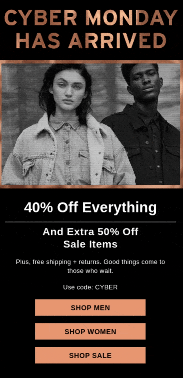
Data shows that for 79% of US consumers free shipping makes them more likely to shop online. And, 96% would shop with a retailer again based on an “easy” or “very easy” return experience. Levi’s takes both these facts into account and even starts their email by playing to this consumer preference.
One big benefit? It keeps the cart abandonment rate in check. ✅
In this campaign, the CTAs are straightforward and there aren’t even any products in the spotlight. Instead, this Cyber Monday email is effective because of its simple and direct offer.
Key takeaways
- Stick to the basics—simple design, clear layout, and straightforward CTAs.
- Focus on free shipping and returns. Don’t forget to mention it on the product page too.
- Offering a site-wide discount code? Add it automatically on the checkout page.
Everlane’s agreeable framing
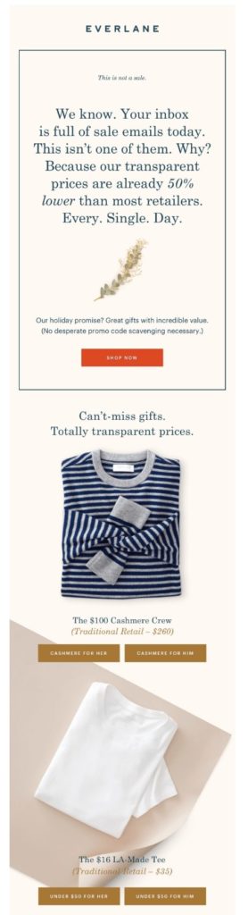
In this campaign, Everlane makes a clever comparison. By framing their lack of Cyber Monday sale in a positive light, they’re setting themselves apart from other brands and playing on their customers’ curiosity.
Their Cyber Monday email starts with an intriguing subject line— “No sale today. Here’s why”. This makes customers stop in their tracks and think—wait, what? Isn’t it Cyber Monday? And what happens next? They click open.
Then comes the email content. They explain why there’s no sale—their prices are already 50% lower than most retailers, every day of the year. In other words, their customers get a good deal all year round, and that framing changes everything. 😮
Plus, they mention their transparent prices side-by-side with the traditional retailers’. Guess who wins from this comparison framing?
Key takeaways:
- Ditch run-of-the-mill email subject lines.
- Don’t be afraid to tell your customers why you’re better than your competitors. (In a friendly way 😃).
- Promote gift guides to ease holiday shopping anxiety and increase average order value.
Huckberry’s long, nostalgia-evoking email
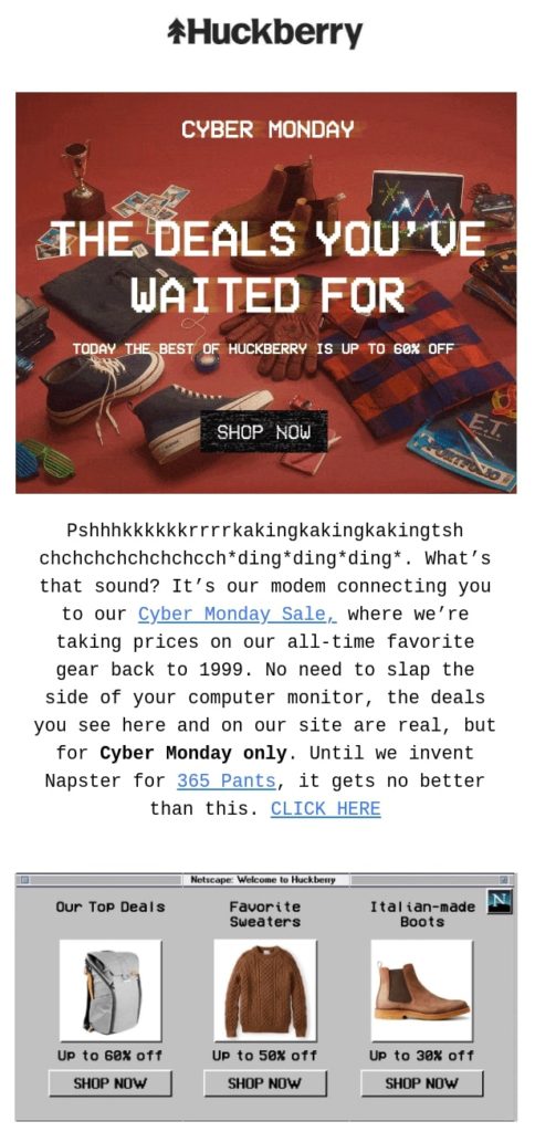
Pixelated fonts and sepia tones evoke nostalgia and make people want to spend money. Surprised? Well, now you know nostalgia has that effect on people. This alone makes Huckberry’s design a smart decision. But they don’t bank on nostalgia alone.
Their email copy is peppered with social proof. Here’s a customer saying that within 30 minutes of wearing the pants, he bought another pair because of how comfortable they were. Now if this doesn’t convince shoppers to add it to their cart, what will?! ⬇️

Further reading: 25+ Free Holiday Email Templates
Plus, their product descriptions are a good mix of features and benefits. Take, for instance, the Faherty Brand clothing below. The implied feature comes from the photo—it’s not bulky like most winter wear. Then comes the explicitly stated benefit—it’ll keep you “toasty warm during the cold weather”. Both address customer pain points and make a compelling sales pitch.
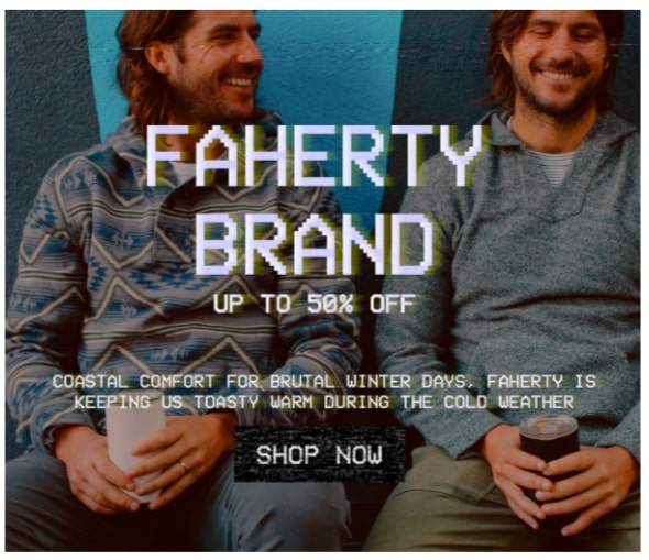
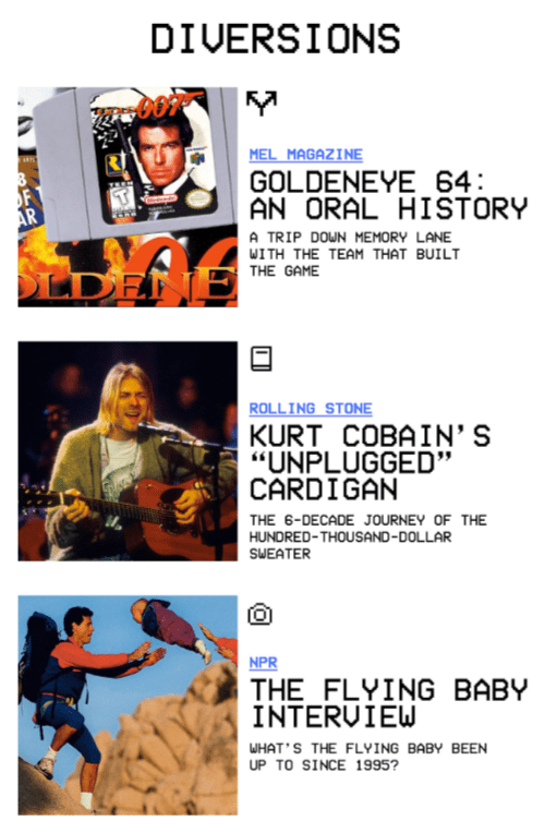
Finally, let’s talk about how they wrap up this Cyber Monday email. The “diversions” section of the campaign gives customers something of value, even if unrelated to the campaign at hand. Moreover, it helps build on the feeling of nostalgia running throughout. 😎
Key takeaways
- Be sure graphic design and written content go hand-in-hand.
- Balance your products’ implied and explicit benefits.
- Don’t be afraid to experiment with long emails.
Want to design eye-catching emails like this? Try Sendinblue.Free plan includes access to all core email features, 300 emails/day, 70+ email templates, and customizable signup forms to grow your blog email list. |
Old Navy’s ingenious use of subhead
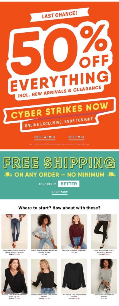
Old Navy’s Cyber Monday email starts with an attractive 50% off everything announcement. The bright colors, large text, and urgent call to action immediately engage customers. But just below, the helpful “where to start” subheading keeps them from panicking. 😅 It leads them directly to the product line.
This email campaign is a prime example of how to use subheadings and whitespace. Here, they make for a powerful contrast and help get the customer on track. After all, your audience’s inboxes will likely be flooded with Cyber Monday emails. Why not make it as easy as possible for them to find what they’re looking for?
Key takeaways
- Send personalized emails with recommendations that are specific to individuals on your list. It makes them feel valued and increases the likelihood of them buying from your business.
- Don’t be afraid to open up your inventory, but make sure your products are bundled under logical subheadings.
Pay attention to newsletter layout. Use whitespace to make your email scannable. Customers can scroll to the section useful to them instead of running around in circles.
MeUndies’ GIF-focused final Cyber Monday call
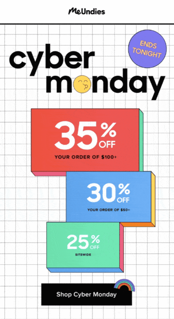
This Cyber Monday campaign doesn’t have much text. But this doesn’t mean it’s ineffective. It’s a great example of how GIFs in email can go a long way. MeUndies does a good job of communicating their simple message—the end of their Cyber Monday sale—without coming across as nagging or over-wrought.
The result? Customers are more likely to click through and buy something. 🤑
Design-wise they are on-brand too. The flying kiss emoticon is MeUndies in their true element. Known to be a fun brand, this email speaks to their audience.
Key takeaways:
- Embrace simplicity. Stick to one CTA to minimize distraction.
- Let GIFs do the talking. Sometimes text-heavy campaigns are just too much.
- Stay true to your brand personality so that customers know it’s you knocking on their door.
Huckberry’s urgency-packed text-only email
Remember the Huckberry’s email we looked at earlier? They followed it up with a last-minute text-only email. The subject line read “3 more” and immediately stood out.

But “3 more” what, right?
While this is technically a holiday email subject line, it’s subtle suspensefulness sets it apart from other more in-your-face Cyber Monday campaigns.
Now about the text-only part. It’s effective because it’s short and scannable. In addition, your audience is unlikely to be expecting this sort of email. In fact, this campaign looks more like a personal message.
This design (or lack thereof) choice is a great way to speak directly to your subscribers and make them feel like people rather than just buyers. It’s almost like their friend sent them an email telling them about something they might like.
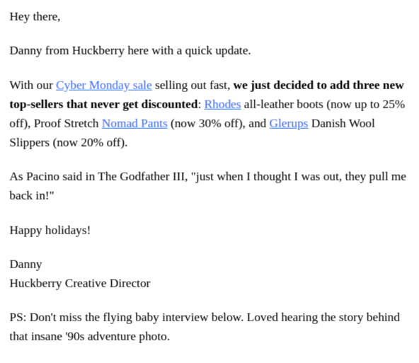
Again—in their signature-style—they even quote The Godfather. This shows they know how to humor their customers with something they’ll relate to.
Key takeaways
- Don’t overlook text-only emails.
- Make use of curiosity in the email copy and subject lines of your Cyber Monday campaigns.
- Craft a campaign that builds up to your final email.
Further reading: 40 Black Friday & Cyber Monday Email Subject Lines to Boost Your Open Rate
Get Set to Send Your Cyber Monday Emails
To recap—the Cyber Monday email examples listed above stand out because each is designed keeping customers’ decision-making in mind. 🤔 This is the biggest day of the year for online shopping, so your average run of the mill email just won’t cut it!
If you’re looking to elevate your email marketing strategy, try Sendinblue. With the intuitive drag-and-drop editor you can easily design impressive email campaigns—no coding knowledge required.
And with A/B testing, you can even play around with different subject lines and content to see which version gets better open rates and click through rates.
We hope you’ve found this content helpful! Subscribe to our newsletter for a monthly round-up of our top marketing tips ⏬