Deutsch
 EN
EN Español
 Français
 Italiano
 Português
You’ve probably already heard that the brain processes visuals 60,000 times faster than plain text. But do these visuals play the same role in your newsletter?
They certainly do.
In fact, Harry Dry, the mind behind the Marketing Examples (almost viral in a good way) newsletter shares, “If I wrote a newsletter today without an image it would feel wrong.”
But, be warned: too many and too large images in newsletters can quickly get your email the ‘spam’ label. Visual emails also come with the risk of loading slowly. Sometimes, they can get automatically blocked too. Ouch.
Plus, here’s another issue that recent research has dug up: large pictures that are irrelevant and resemble stock photography can quickly get you a thumbs down from your contacts.
This makes visual emails a tricky territory to wade into. Except, it’s really not all that difficult provided you know the right from the wrong (or spammable, really). So, let’s dedicate this post to separating the two.
We aren’t going to focus on email design. Instead, we’ll pay attention to the kit of the caboodle – the visual element of a newsletter. To be more specific, we’ll talk about what kinds of images you should use in your newsletters.
Let’s roll:
How well do visual emails perform?
Very well. In fact, they can get you a click through rate (CTR) that’s as high as 42%. Nope, I haven’t just pulled this out of thin air – Vero learned this after analyzing 5000 email campaigns with and without images.
They found that campaigns with images got a 42% higher CTR than those without them. I also asked actual humans who run successful newsletters (the kind that I and many others wait for) for their take on newsletter graphics.
Harry opined newsletter images are an easy way to stand out from the rest. He’s not wrong considering the images in his newsletter are widely circulated on social too.
He reminisces, “back in the early days I used to write full text emails and then as people started commenting more and more on the images I started putting more and more time into them.”
Mary Ellen Slayter, the superhero behind Friday emails by Managing Editor (another newsletter that’s a marketer’s beloved) makes similar observations. She explains, “I can say that the images in our newsletter are often what prompt the most response from our subscribers.”
These suggestions make a solid case for images in newsletters. So, let’s dig deeper into the matter.
Images for newsletters: getting them right
You need to know three things before you go about playing with newsletter images: your visual’s goal, some basics, and the right dimensions.
Here are the details:
Newsletter graphics: know your goal
The goal for each newsletter’s image can vary. Mary Ellen, for instance, shares her goal with newsletter images is to delight. She elaborates, “images give me the best opportunity to do that, I find. It lightens up the vibe of the more educational/professional content we’re sharing. Spoon full of sugar, and such.”
Marketing Consultant, Dennis Shiao, who runs the Content Corner newsletter thinks of images as the “’taste maker’ of the newsletter, which creates a better reading experience.”
But there’s also a common theme to the images used in all newsletters. This theme revolves around:
- High quality images and
- Images that serve a purpose
Research from the Nielsen Norman Group confirms newsletter recipients expect high quality imagery in emails. They want the same quality as the one they get on the web. In fact, readers appreciate premium quality images that show fine details clearly.
As for the purpose, images could be explaining the point you’ve made or entertaining your readers.
Put another way, don’t use images for the sake of it. Readers are quick to disregard those emails. And, if it happens one too many times, your newsletter is bound to end up unopened.
Newsletter imagery: the basics to know
Here are the essentials of adding images to your email newsletter:
- Add ALT text to your email images
Because ALT text serves an important function: it shows up when images don’t. So, in case your image doesn’t display, an ALT text can save the day. It also makes your email accessible for those who can’t see images.
- Don’t clutter your email with images
Whitespace or the space between elements including images and text is your friend. Squeezing in as many images as possible can have damaging repercussions. Besides, adequate whitespace makes your email design easy to scan and digestible.
The NN Group study that we’ve been referring to above also highlights that their participants considered several tiny images as “outdated,” not just cluttered. So there’s that too.
- Don’t go with very large images as well
Both tiny and too large come with consequences. So, it’s best to aim for balance. And, remember: give no more than 20-30% of your newsletter real estate to images.
Newsletter image dimensions to know
The last important piece to this puzzle – the size guide that you need to commit to memory:
- Width wise, keep your images to 600 pixels at most
This is your newsletter’s maximum width. If you go off course, you’ll annoy the reader as he’d have to scroll side to side to view the picture.
- Images in newsletter size: up to 1 MB
For other background images and GIFs in emails, keep the size to 3 MB.
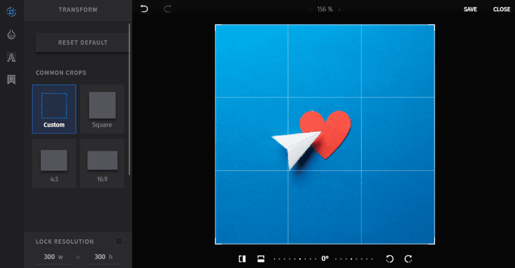
Fortunately, with Sendinblue, you get an inbuilt image editor that can change your visual’s size and resolution. You can find this option under ‘Transform’ where you can pick from commonly used sizes such as square, a ratio of 16 by 9 or 4 by 3. Or you can create a custom size for your image.
- Make sure your images aren’t too close together
While there’s no harm in this, it’s good to recall that visuals break text to make it easy to read. If you’re concentrating all your images in one section, you’re basically killing a key function of visuals.
How many images should you include in your newsletter?
There’s no wrong or right answer to this. You could play with one or 10. Harry’s newsletters contain 3-10 images per newsletter.
Take a look:
Mary Ellen eases the confusion for those who are only just starting a newsletter: “It’s better to have one really strong one [image] than a bunch of mediocre ones.”
What sort of newsletter images should you add?
Alright, so you now know you can’t underestimate the role that images play in your newsletter, the best size for them, and how many look good in your emails.
Let’s look at another important aspect of visual emails: the types of images you should add to your newsletter. Again, there are no hard and fast rules here. Anything high quality and original (not mediocre stock photography) that’s meaningful works.
You can try the following:
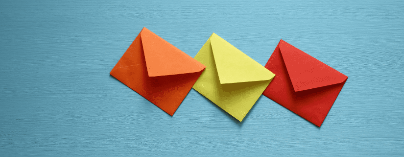
- Illustrations
Like Grammarly uses:
You can add text on top of illustrations or tweak the text’s font as well with Sendinblue’s image editor.
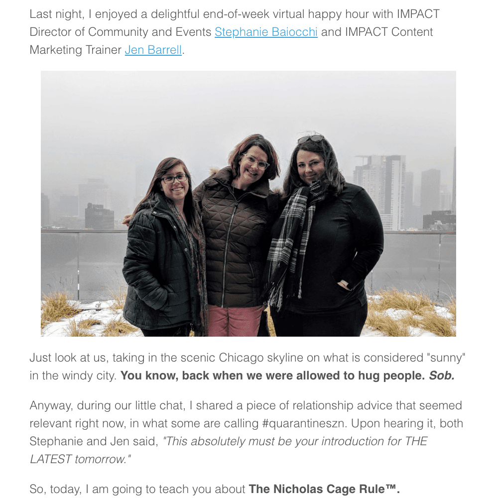
- People-centered photography or behind the scenes (BTS) imagery
Semiotic surveys confirm pictures showing people at work way better for marketing than landscape or object-containing pictures.
Learn from The Latest newsletter by Impact:
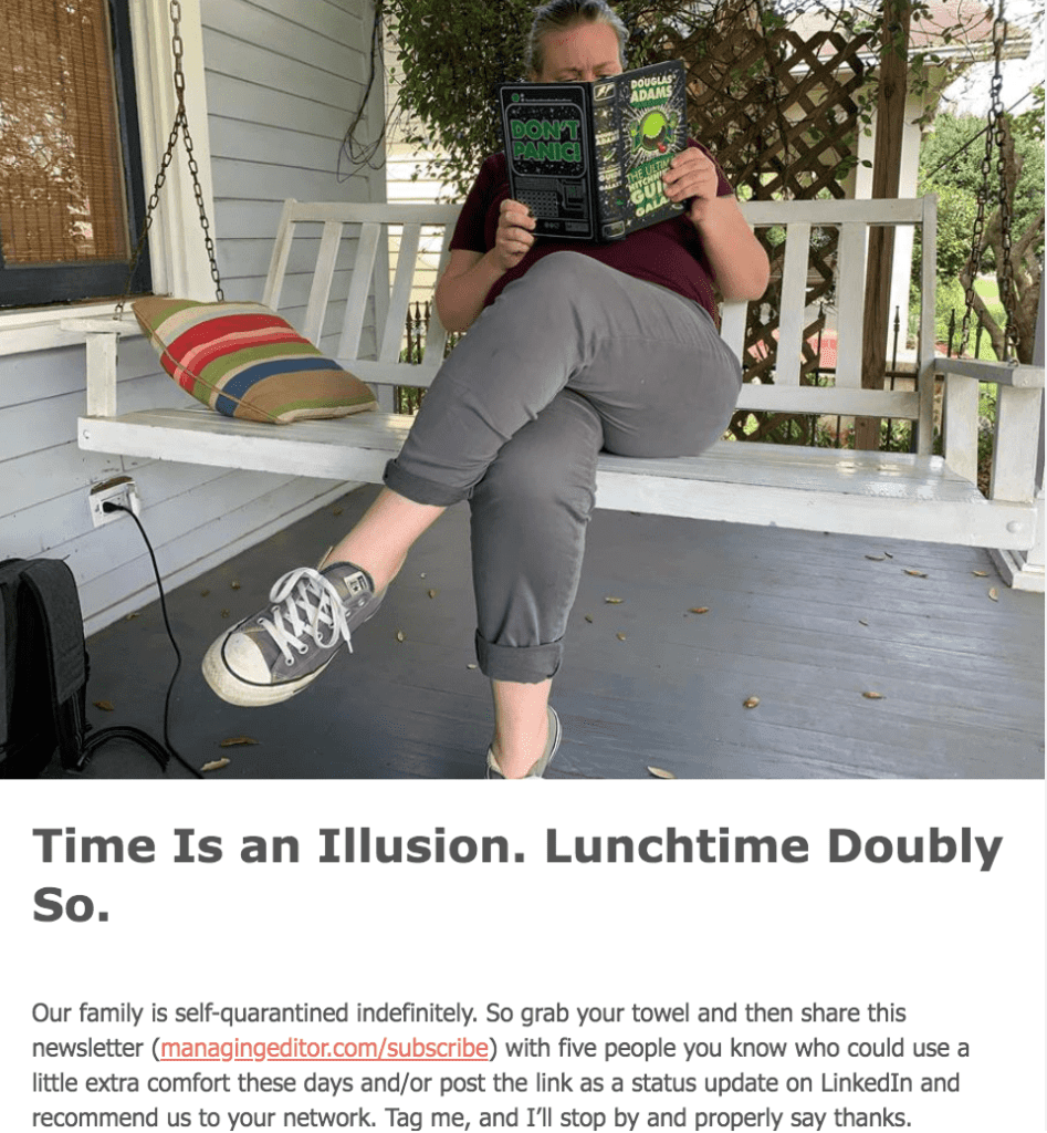
- Relaxed, real poses
Since we’re already talking about BTS content, you might as well note that staged images don’t do the trick. Authentic images with a personal touch do.
Take a page from Managing Editor’s newsletter:
At the end of the day: “choose images for punch,” as Mary Ellen puts it. In fact, here’s what she uses in their newsletter, “usually a mix of custom illustrations by our staff artist Ivine Badran, pop culture screenshots and gifs. I also try to slip in original photography when I can. Those are generally of items around my house that somehow tie to the theme.”
Newsletter images: bonus tips
As we near the end, it’d be best you learn some more quick tips for improving engagement via images in your newsletter. Follow along:
- Have a specific style
Or, you could say, use on-brand images. This makes the images you use in your email memorable. And, your readers will instantly recognize you outside of their inboxes too. Not to forget, such images also, “signal you’re putting the work in. People pay more attention when they know you’ve put the work in,” in Harry’s words.
His newsletter imagery stands out the most. He says, “all my images have a specific style. I don’t just drop in random images. I give them all the same dark blue background. And use consistent arrows, red cross/green ticks etc. This means people know they’re ‘Marketing Examples’ images.”
Example of an image from the Marketing Examples newsletter
Alternatively, you can create a particular style for your images by using a specific filter. Sendinblue makes it easy for you to choose from filters to add on your email images. You’ll find these filters on the left hand side of the image editor.
- Your images are clear
Meaningful and purposeful – yes. That’s important. But another crucial factor is clarity. Harry adds to this, “the image has to be easily consumable. People scan images. Clarity above all else is my golden rule. And if this means simplifying your message then so be it.”
- Make sure your email is responsive
This one’s a common slip. Dennis opens up about it. He shares, “in a recent issue, I made a mistake:
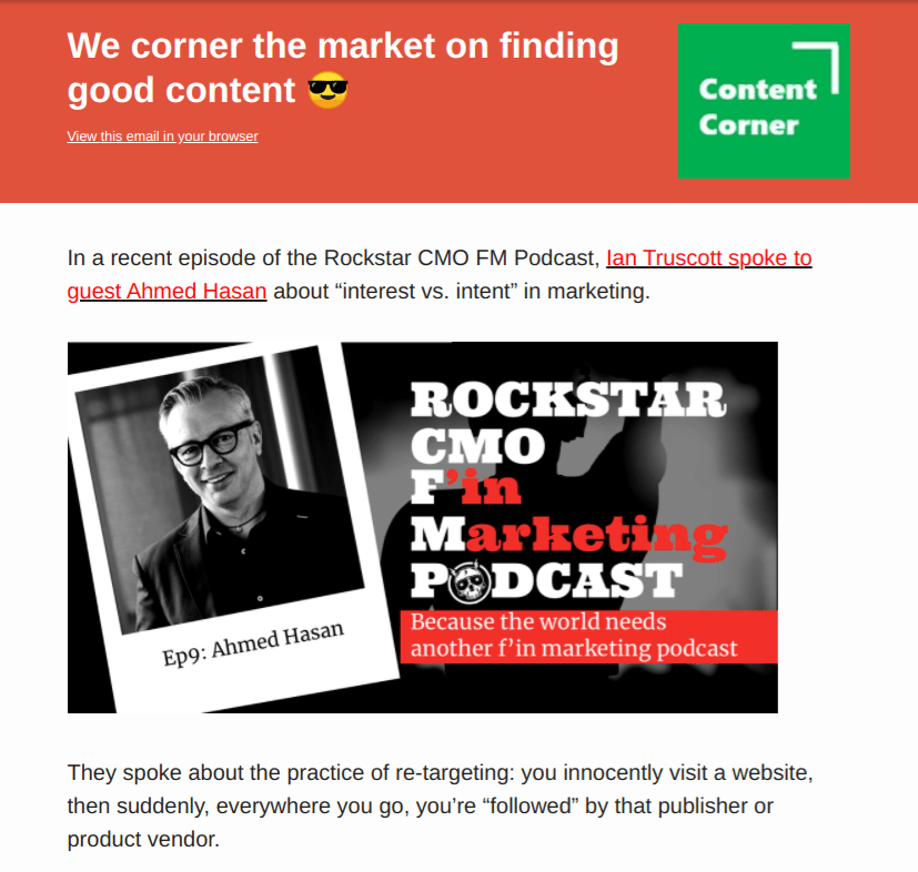
This is the introduction section of my newsletter. For the image, I specified a width of 512 pixels, which nicely fit inside that section. Below the introduction, however, the layout moves to two columns.
The result? While this looked fine on desktop, on mobile, the use of the 512 pixel-wide image compromised the responsive design. The copy rendered in a smaller font and became harder to read (on a phone) compared to my “normal” issues. For each issue, I send a preview and review that on my phone. For some reason, I missed the responsive design issue before sending this one out.”
The solution? Do what Dennis does – always preview emails before sending them and pay attention to responsive design. If you find it hard to manually design responsive emails, start with Sendinblue’s free newsletter templates that are both beautifully designed as well as fully responsive.
Ready to send glorious emails with on point newsletter images?
Although everything that we discussed is important, we can boil it down to this: be sure to use original, high-quality newsletter images that are legible and add to your email’s visual appeal.Looking for more newsletter examples to learn from? Here you go. Don’t forget to keep in touch with us on Twitter.
Written by Masooma Memon, freelance writer for B2B SaaS.