
U.S. e-commerce continued to grow in Q3 2017, and Q4 is shaping up to be even better with the holidays just around the corner.
So, how do companies get their message out and communicate it to their customers?
The most productive way a company can capture consumer attention is through email marketing. In fact, a recent survey reported that nearly 60% of millennial consumers named email as their preferred channel to receive marketing communications from retailers. So, no more with the “email is dead” clichés! 😉
With Black Friday in the back view mirrors and the holidays at the forefront, it’s important to have well-designed email strategy to make your business stand out in your subscribers’ inbox.
To give you some inspiration, we created an email case study that dives into the strategies of three ecommerce brands, pulling out the top takeaways and best practices.
The Contenders
Frank & Oak
Founded in 2012, Frank And Oak has been helping young men and women dress better, and affordable, via a smart combination of design and technology.
Forever 21
A clothing store that carries the latest LA fads in clothes, accessories, shoes for young women and men.
Uniqlo
Clothing retailer producing a collection of casual wear & accessories for men, women & children that come from their Japanese values of simplicity, quality, and longevity.
Methodology: How we gathered the emails
In examining the email marketing for both companies, I created accounts for each site in order to start receiving their marketing communications. The accounts were used as follows:
- Opted for email listings first before creating an account
- Browsed websites and clicked on product links for email opt-in strategies
- Created an account on all three brand websites, browsed items and abandoned the carts
- Purchased an item from each store to examine their transactional emails
Comparing the Email Marketing Strategies of Frank & Oak, Forever 21, and Uniqlo
Now that you are familiar with the companies and the methodology, let’s take a look at the marketing tactics we’ll be going over:
- Welcome Emails
- Onsite CTAs
- Abandoned Cart Follow-up Emails
- Transactional Emails
Welcome Emails
In one of our previous blog posts, we made the case of why businesses should have a welcome email. They’re a great way to kick off a strong relationship with new customers and allow you to set expectations for future communications.
Nearly three quarters of customers expect a welcome email when they subscribe to a brand’s newsletter. That’s why it has become more important than ever to integrate this type of correspondence into your business’s email marketing strategy.
So, let’s take a look at how our contenders did with their welcome emails.
Frank & Oak
Frank & Oak did not send out a Welcome email.
Forever 21
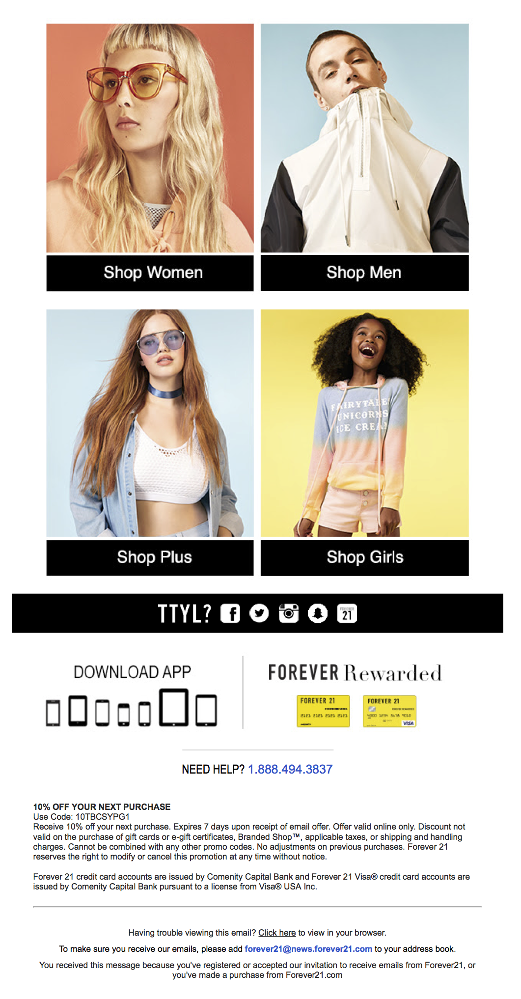
Forever 21 took a similar approach to Uniqlo, offering a 10% off discount code to try and convert new subscribers ASAP. Their welcome email also includes a short body of copy that sums up the value new subscribers will get from their newsletter (first look at new arrivals, promos/sales, exclusive offers).
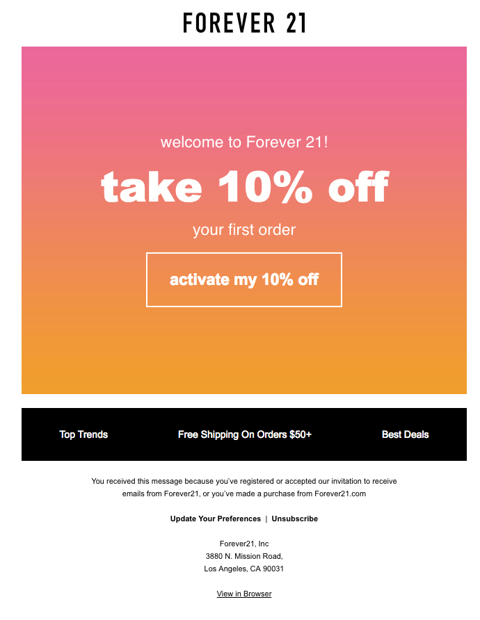

Then, they reinforce the discount that subscribers earn by sending another email solely dedicated to the discount with a button encouraging subscribers to activate the coupon.
- Use of warm colors and minimal design
- Included coupon code to encourage new subscribers to make a purchase
- Followed up with a reminder email about the discount
The Bad
- Store locator button could be used for driving in-store traffic
Analysis and Lessons Learned
Forever 21 stayed true to their brand in these welcome emails, with warm colors, minimal design, and interesting images to showcase their style. These emails do an excellent job of attracting the reader’s eye, and the coupon code works to get subscribers to start shopping immediately.
Because this is a retail brand in addition to its ecommerce presence, they might have benefitted with a better CTA to drive in-store traffic in addition to online sales. But, other than that, these emails serve as a great example of what you can do to welcome your new subscribers.
Uniqlo
Uniqlo’s welcome messages focused on getting new contacts to make a purchase as quickly as possible.
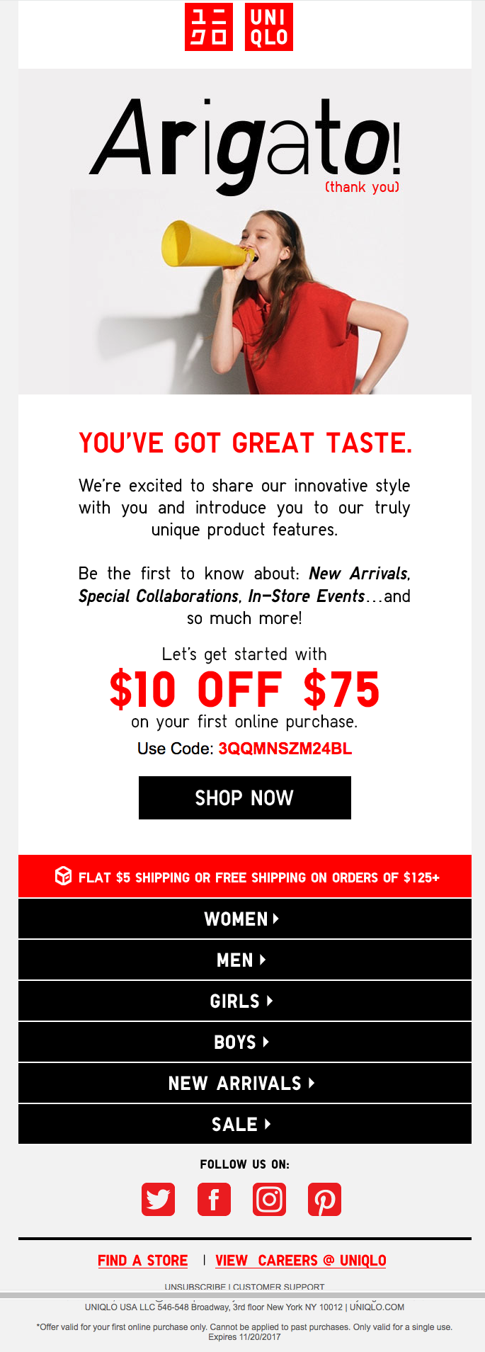
They sent out a welcome email that contained a nice discount code for $10 off on any purchase greater than $75.
After failing to make a purchase using the coupon codes, Uniqlo followed up with a reminder email to further encourage new subscribers to make a purchase.
- Provided a coupon code for new subscribers
- Sent a follow-up reminder with the coupon code to drive shoppers to convert
- The first email does a great job of restating value proposition for subscribing (“Be the first to know about…”)
- The second email communicates strong company values, and the first email had a nice homage to the company’s Japanese roots with the “Arigato” image.
The Bad
- Absence of products in the welcome email
- Lack of communication on frequency of emails that customers can expect
Analysis and Lessons Learned
Uniqlo seems to be less aggressive about promoting their products in their welcome emails, instead choosing to focus on promoting their company values. In doing so, subscribers get a better picture of the company and what they believe in.
Their heavy use of CTAs linking to their product categories on the lower half of their email leaves room for customer curiosity. Once subscribers see the discount, it’s up to them to decide where they want to start shopping. This works well for a company like Uniqlo because their offerings include both men, women, and children categories.
While it’s usually better to make CTAs as targeted as possible to increase the chance of engagement, welcome emails are a different story because you still might not know much about the subscriber.
Uniqlo takes advantage of this initial contact email to keep things broad and let new subscribers explore offerings on their own, allowing them to get acquainted with the brand. If you only have a few product offerings, it’s probably better to take more of a product-focused approach instead.
Onsite CTAs
Email opt-in CTAs need to relate to the content and design of the page. Popups should grab the attention of potential subscribers without disrupting the “feel” of the webpage. This will make the request seem more natural and give a better overall customer experience.
So, let’s see how our companies performed in this category:
Frank & Oak
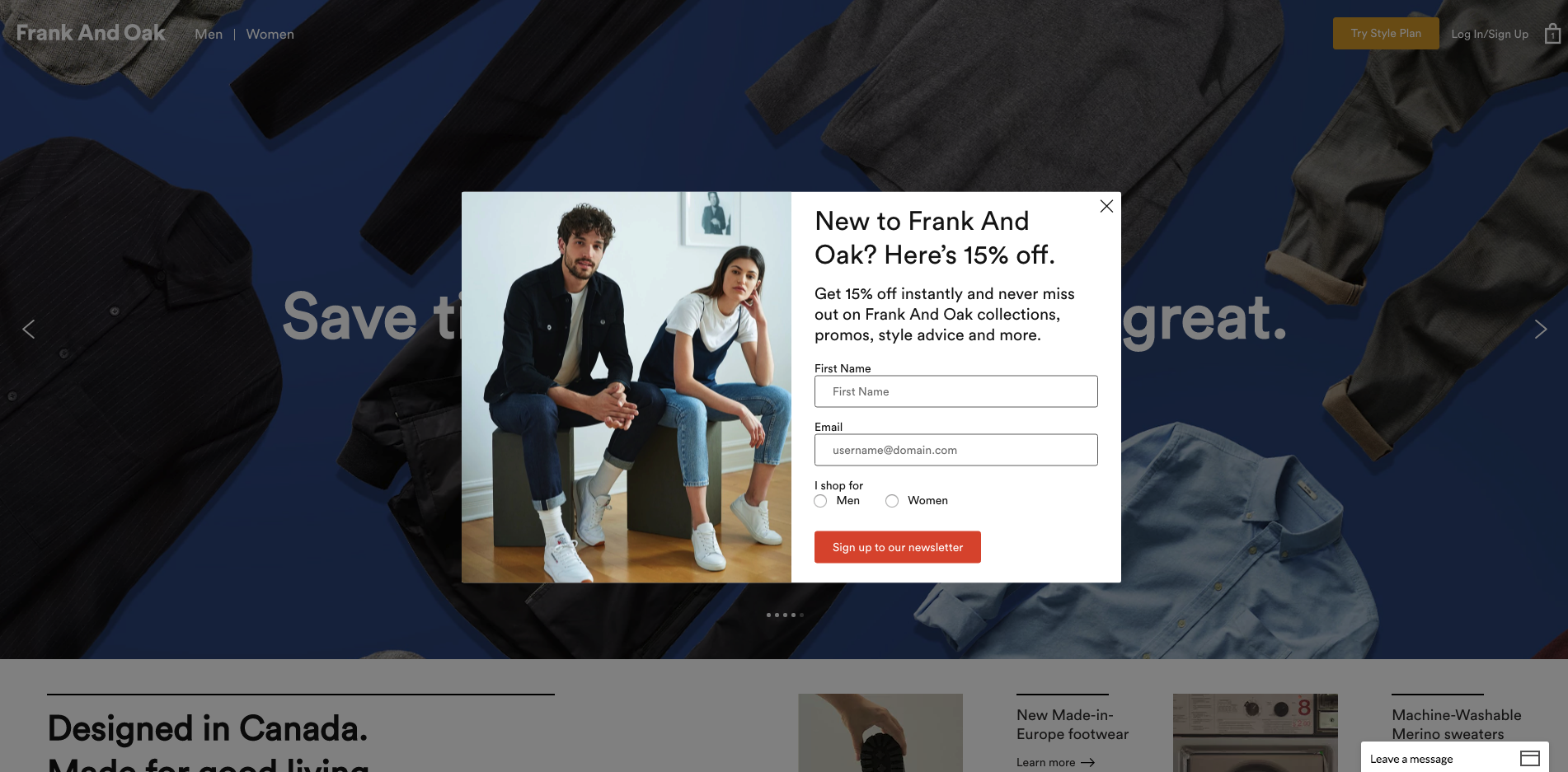
Within a couple of minutes of visiting the Frank & Oak website, new visitors are greeted with an email opt-in popup including a discount. The copy introduces the value (in this case, a discount) newcomers will receive by subscribing to their email list and creating an account.
- Good timing of popup to make sure visitors have enough time to browse first
- Overlay design isn’t too disruptive to user experience
- New visitors are greeted with an email opt-in message including a 15% off their first order discount
The Bad
- Too many form fields and steps to subscribing
- Once you click the button you are then redirected to another page finishing up an account with Frank & Oak
Analysis and Lessons Learned
In order to encourage site visitors to sign up for their emails, Frank & Oak set up an overlay popup to capture new subscribers. They did a really nice job of mitigating the intrusiveness of this call to action by giving visitors enough time to browse the site and better understand what Frank & Oak is offering before asking them to sign up. It can be a very bad user experience to show up to a site and immediately receive a CTA to subscribe.
Although they do a nice job of making the popup unintrusive, Frank & Oak included too many form fields, and the popup actually redirects to a new page where visitors are asked to fill in, even more, information to complete their account. This isn’t great because it gives visitors extra chances to fall out of the signup process before completion. That’s why you should always make your signup CTAs as simple as possible.
Forever 21
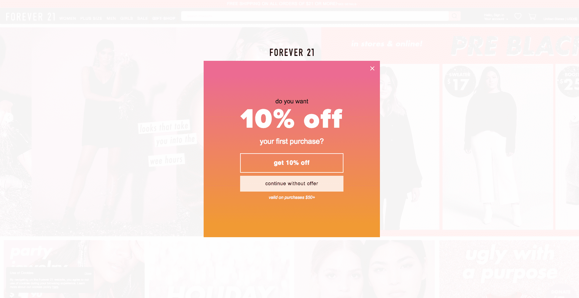
Forever 21’s popup keeps the CTA simple, “Do you want 10% off or do you want to continue without the offer?”
Instead of using yes or no, the popup body copy has persuasive language that incentivizes readers to take the 10% offer instead of continuing to browse through the site aimlessly.
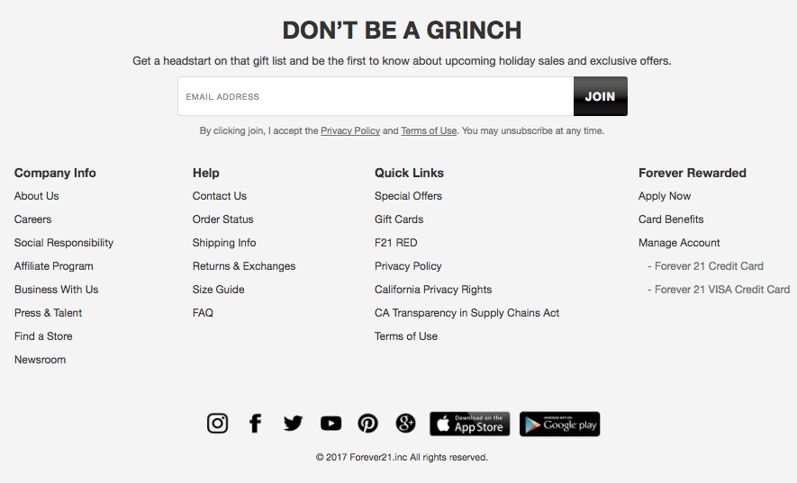
Just in case the popup fails, Forever 21 also include a subscription form at the bottom for visitors to signup for the newsletter if they want.
- Used the same color design from the welcome email
- Copy gives readers FOMO for the 10% discount offer
- Includes backup subscription form in the footer with timely CTA copy
The Bad
- Footer opt-in is easily overlooked
Analysis and Lessons Learned
Simple but effective, this notification keeps the same design as the welcome email and the copy is short and to the point. In order to get this 10% off, newcomers will need to opt into their email list.
Their backup CTA in the footer is a good way to make sure they optimize their signups, and the seasonal CTA copy is a nice touch. But, they might benefit from putting this opt-in form in the sidebar or navigation instead buried in the footer.
Uniqlo
Uniqlo clearly hasn’t prioritized their email list for developing new leads, as they only included one CTA on their site for signing up and it was in the footer of the site.
- Includes a mention of their welcome offer
- CTA shows up on every page of the site
The Bad
- Copy doesn’t clarify what users would get by subscribing
- No popups or other more noticeable CTAs
Analysis and Lessons Learned
Although Uniqlo does offer new subscribers a discount when they sign up, they don’t use this to their advantage when trying to attract new subscribers with their onsite optin form. Instead they chose to bury it at the bottom of the site and keep the language general.
Clearly, the goal of their email marketing is to nurture relationships with customers who sign up for an account before or during checkout, rather than nurturing new relationships through newsletter content and promotions.
Email Preferences
The email preferences page is the place where you can start collecting more information from subscribers to create personalized email campaigns and receive better engagement.
It’s a chance for your contacts to communicate more clearly what they’re looking to receive from your company’s emails.
Frank & Oak
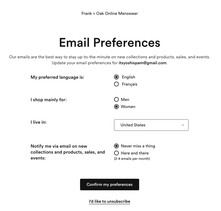
- A lot of customization options (language, gender, geography, frequency)
- Link to another page where you can unsubscribe
The Bad
- Lack of design makes the page less engaging
Analysis and Lessons Learned
Based in Canada, Frank & oak recognizes that their brand transcends boundaries and languages. It’s important that their email preferences reflect their global appeal by providing options that accommodate their markets.
It’s also smart that they linked out of this page in order to opt out. Creating a dedicated page to opt out makes your email preferences page cleaner.
Forever 21
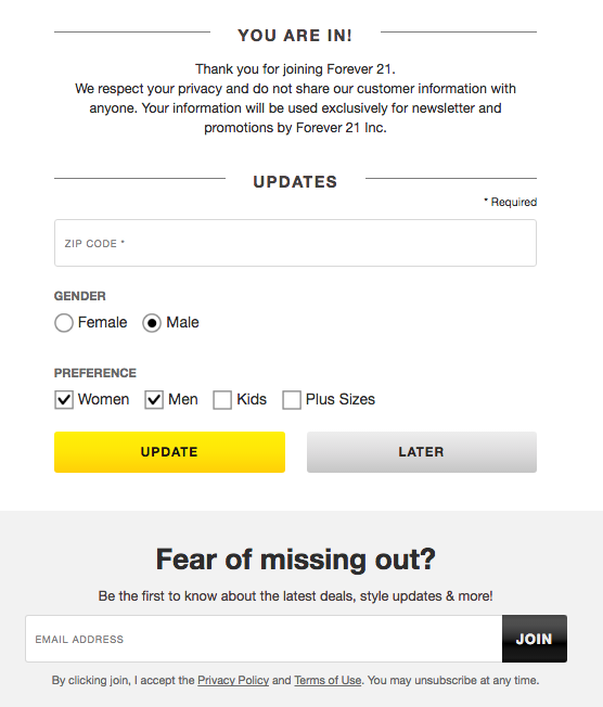
Forever 21’s email preference page has a selection of options that gives subscribers more control over their correspondence with the company.
- Solid customization options (gender, geography, frequency)
The Bad
- Can’t edit your email address
Analysis and Lessons Learned
Most people take choice for granted Thankfully, Forever 21 takes choices into account on their email preference page.
They understand that most of their subscribers who shop with them value choice. This amount of customization will foster more customer engagement and gives Forever 21 more room to tailor email campaigns lists more productively.
Uniqlo
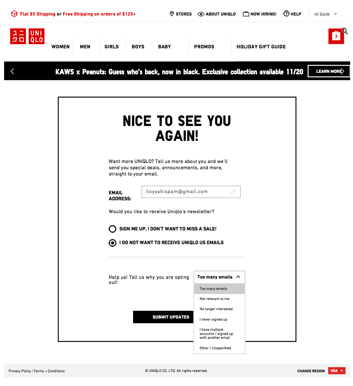
Ringing true to their company value of simplicity, Uniqlo’s email preference page doesn’t have the bells and whistles that Forever 21 and Frank & Oak have.
- Gives you an option to change your email
- Design stays in company brand theme
The Bad
- No option for how frequent subscribers can receive emails
Analysis and Lessons Learned
Uniqlo did a nice job of confirming that subscribers entered their email contact information correctly, and also makes it easy to unsubscribe, which is definitely good user experience. But, they failed when it comes to letting contacts have more of a say in the types of emails they receive. They didn’t offer any customization of preferences for gender, frequency, or any other elements that would make personalization easier.
Abandoned Cart Follow-up Emails
Last year, 77.24% of global shoppers chose to leave the site without completing a purchase.
Shopping cart abandonment is a problem for any ecommerce business, which is why setting up an abandoned cart email workflow is a great idea.
This type of email enables you to win back some potential lost sales and increase your revenue.
Let’s see how our companies did on winning back lost sales:
Frank & Oak
Opening up the abandoned cart email from Frank & Oak, subscribers are reminded right off the bat to use their 15% off coupon code.
I know I’m guilty of forgetting to use discounts when I check out, so receiving a friendly reminder is a plus in my book.
- Reminder of the initial discount
- CTA promoting their customer loyalty program
- Customer service information
The Bad
- No product recommendations
Analysis and Lessons Learned
Frank & Oak’s email has a great design with the remainder of the 15% discount at the top of the message. This is smart because many people abandon carts because of unexpected costs, so a reminder of the discount might encourage them to follow through with the purchase.
The only thing missing here is product recommendations. These could also help make the difference for customers who were looking for something specific but didn’t immediately find it on your site.
Forever 21
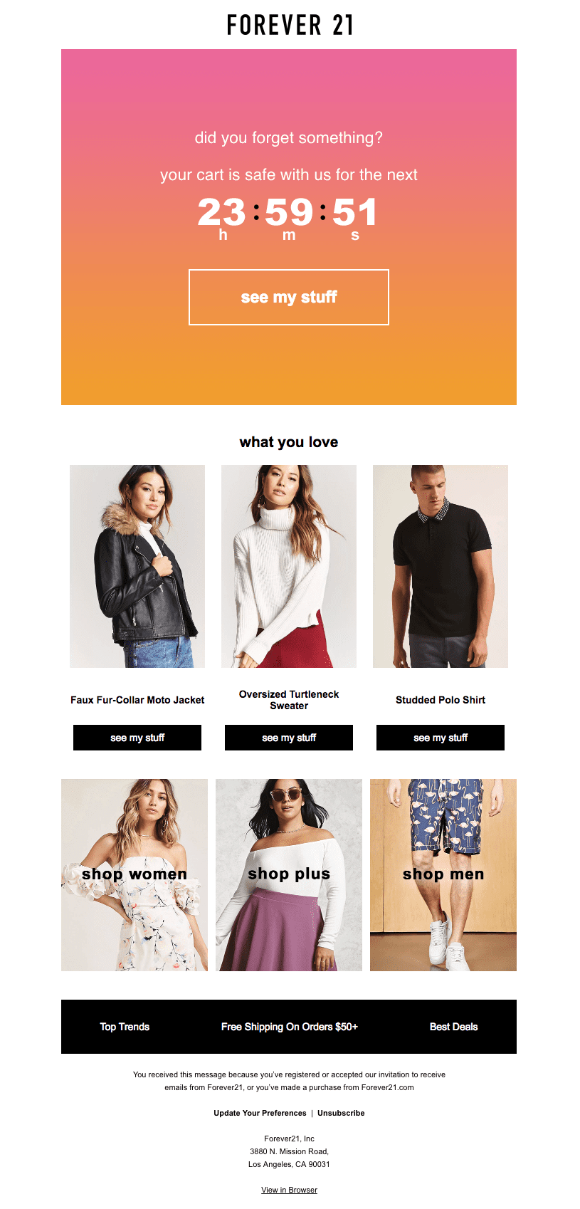
I found Forever 21’s abandoned cart really interesting. They effectively create a sense of urgency with the customer by using a countdown timer in the email. This prevents customers from saying “I’ll get back to that later,” which can really help for increasing conversion rates.
- Countdown timer is a unique way to incentivize your subscribers to check out what’s in their cart
- CTAs to revisit the main store
- Symmetry in the template
The Bad
- Missed opportunity for promoting loyalty programs
Analysis and Lessons Learned
Forever 21 uses a very nice layout, with the countdown clock front and center and a brand-consistent design. You don’t usually see this kind of thought put into an abandoned cart message.
The countdown is a very effective tool to get customers back on your site quickly. The only thing they could’ve added is more product recommendations in the email body.
Uniqlo
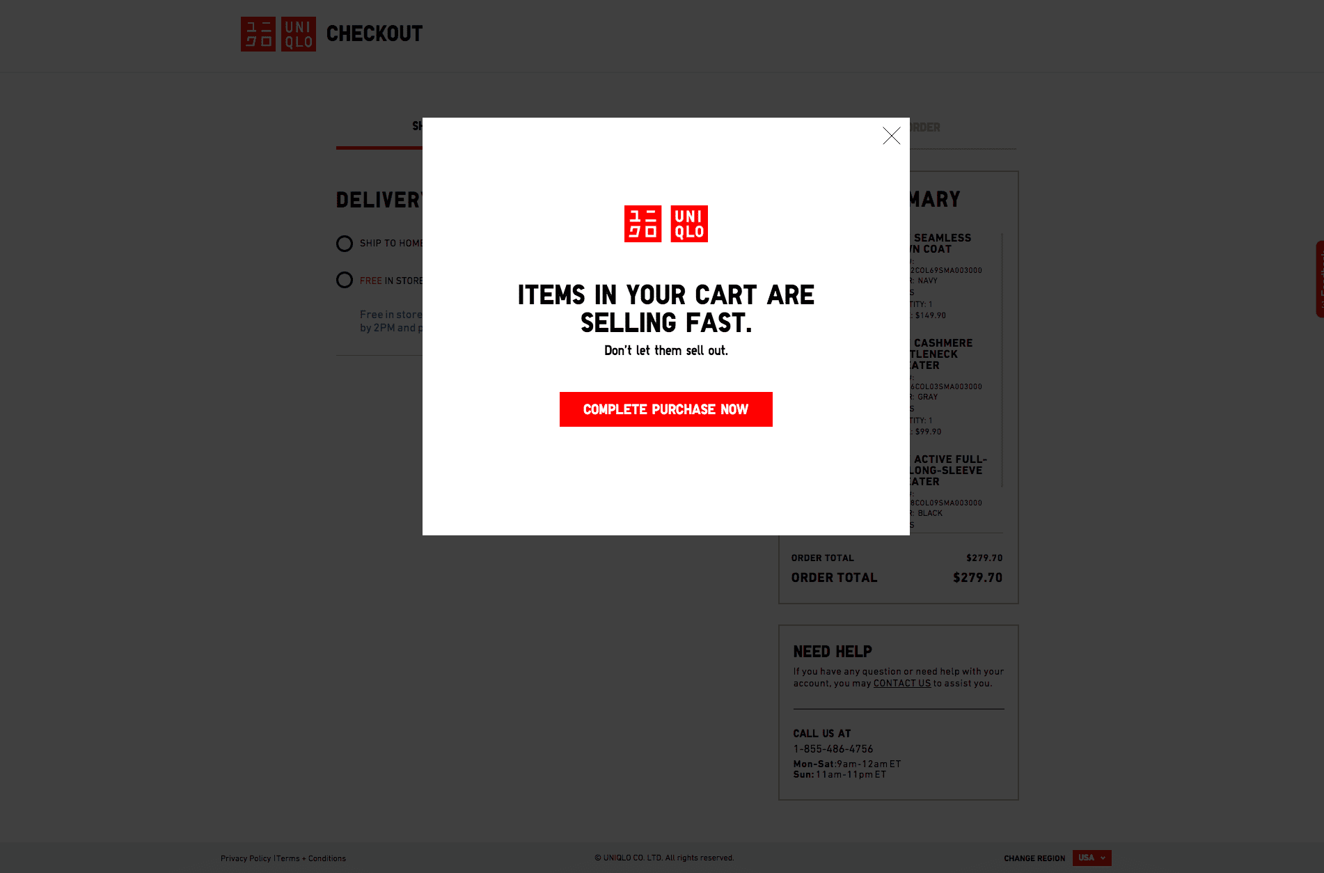
While Uniqlo did not send an abandoned cart email to my inbox, they did use an exit-intent popup with some effective copy to try and dissuade me from leaving.
- Use of scarcity in the CTA is effective
- Get users before they even leave
The Bad
- No real abandoned cart email
Analysis and Lessons Learned
Uniqlo is the only brand in this case study that creates an overlay popup that catches customers before they leave. Creating this extra step is beneficial for those shoppers who are on the fence about purchasing products.
But, I was not able to trigger an abandoned cart email from them. This is unfortunate because email gives consumers more time to do research and come back to make their purchase.
A customer has many reasons why they abandoned carts at the checkout phase of a sale. So it’s important to keep their attention on finishing the sale by creating popups or notification reminders during the checkout phase of your buyer’s journey, it can help customers complete the transaction.
Transactional Emails
Transactional emails help customers navigate their way through the purchase process.
But, these emails can be more than just basic messages that guide customers through the different stages of their purchase. They also present another opportunity for businesses to insert more meaningful customer-facing content to create a more pleasant buyer’s experience and promote your marketing objectives.
That being said, let’s dive into our analysis for ecommerce transactional emails to see how the companies performed:
Frank & Oak
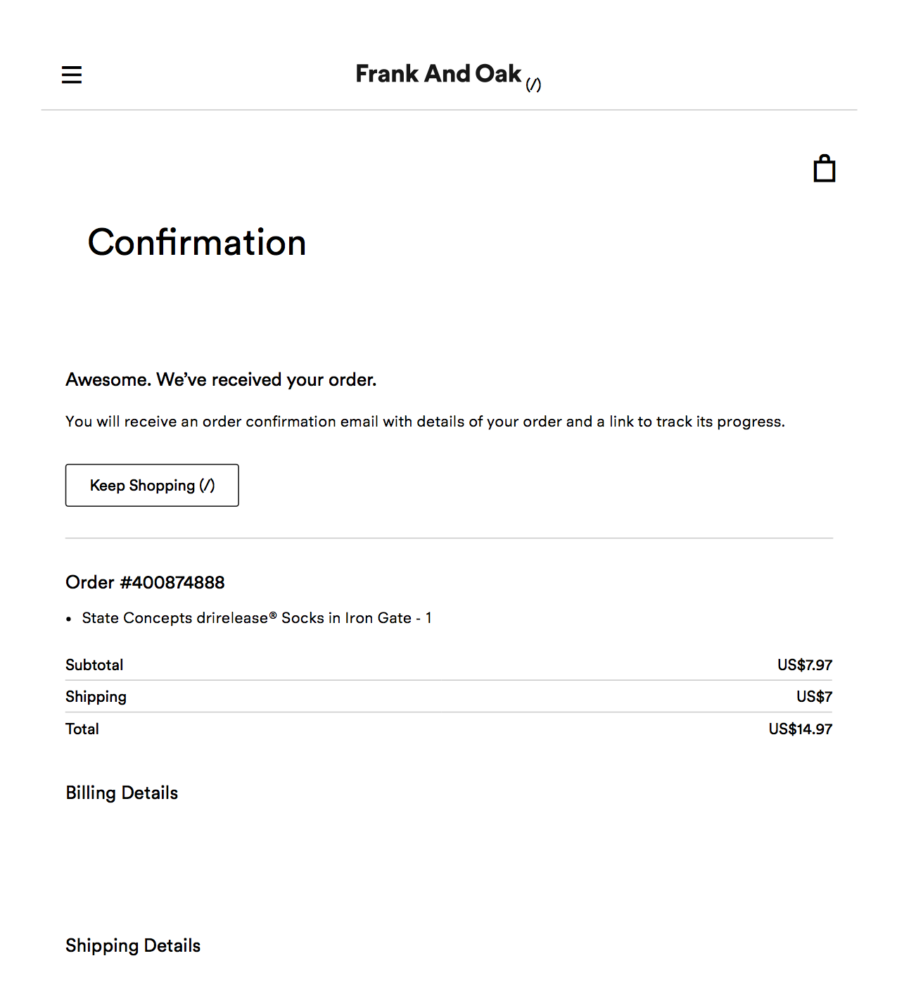
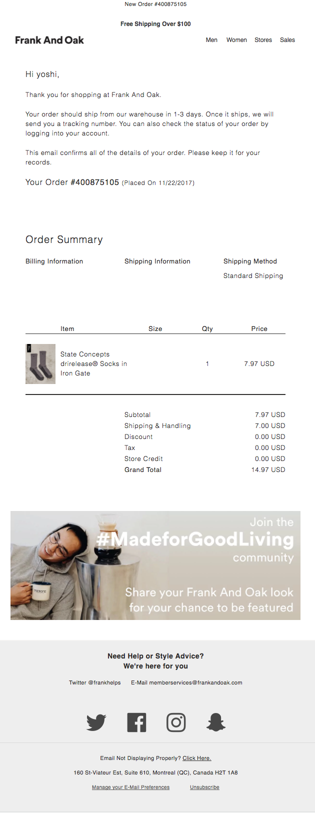
Frank & Oak’s transactional messages do a nice job of balancing white space with important information for a really clean presentation.
They also included a nice shoutout to their social media lifestyle campaign below the transaction details to encourage customers to engage with their brand in other channels.
- Promotes social media lifestyle campaign to increase brand engagement
- Brand consistency in email template
The Bad
- Relevant customer support information is not found
- Doesn’t showcase other products that could complement the purchase
- Missed promotion for other marketing opportunities
Analysis and Lessons Learned
Frank & Oak’s transactional email checks off all the required boxes: details of purchase and shipping information. I also like the usage of a social media hashtag to promote their brand lifestyle. This is an effective reminder of what they stand for, while also creating an excellent platform for meaningful engagement with their customers.
But outside of the required information and social media CTA, Frank & Oak failed to include anything else that might drive traffic back to their site for additional purchases. Because transactional emails have a higher average open rate, it’s always a good idea to include complementary product recommendations, information on current sales, and possibly even special discounts.
They could have also used the space to invite customers to their loyalty program, which would make retention and repeat purchases much easier.
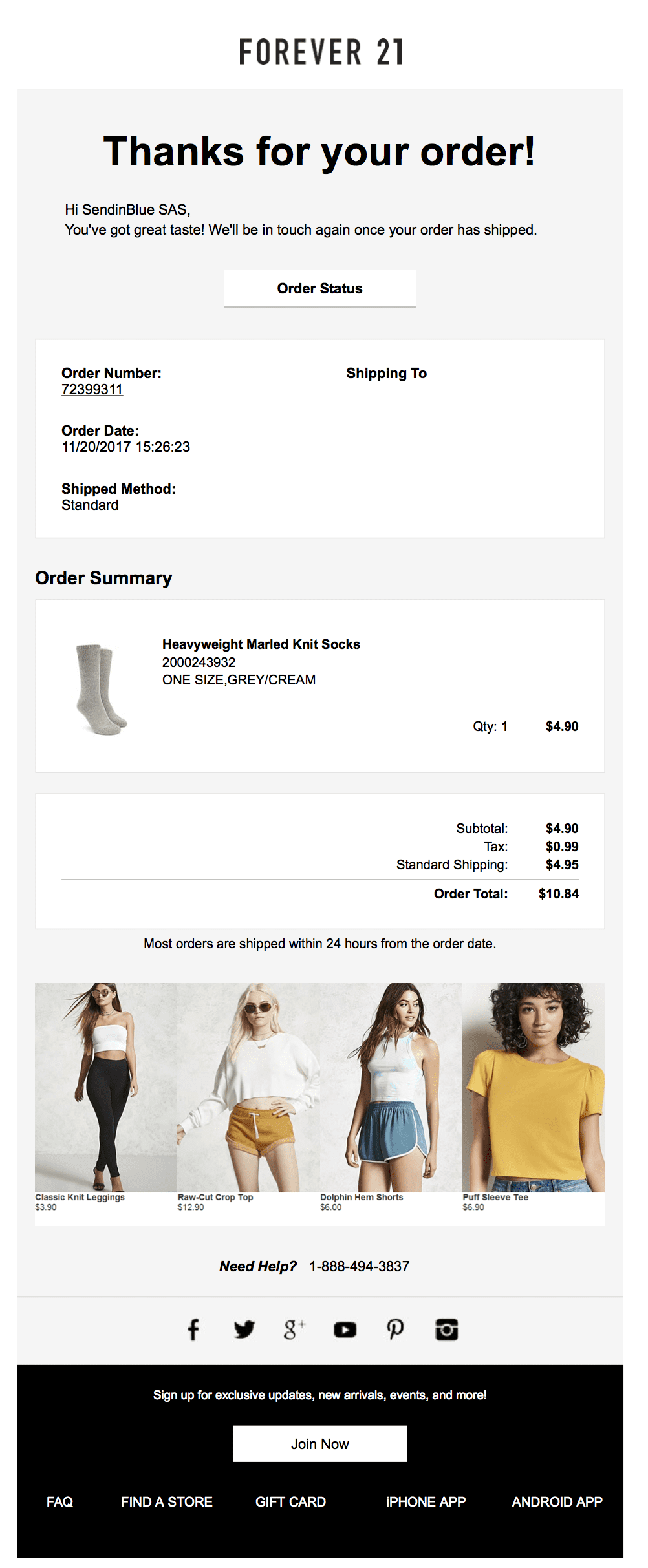
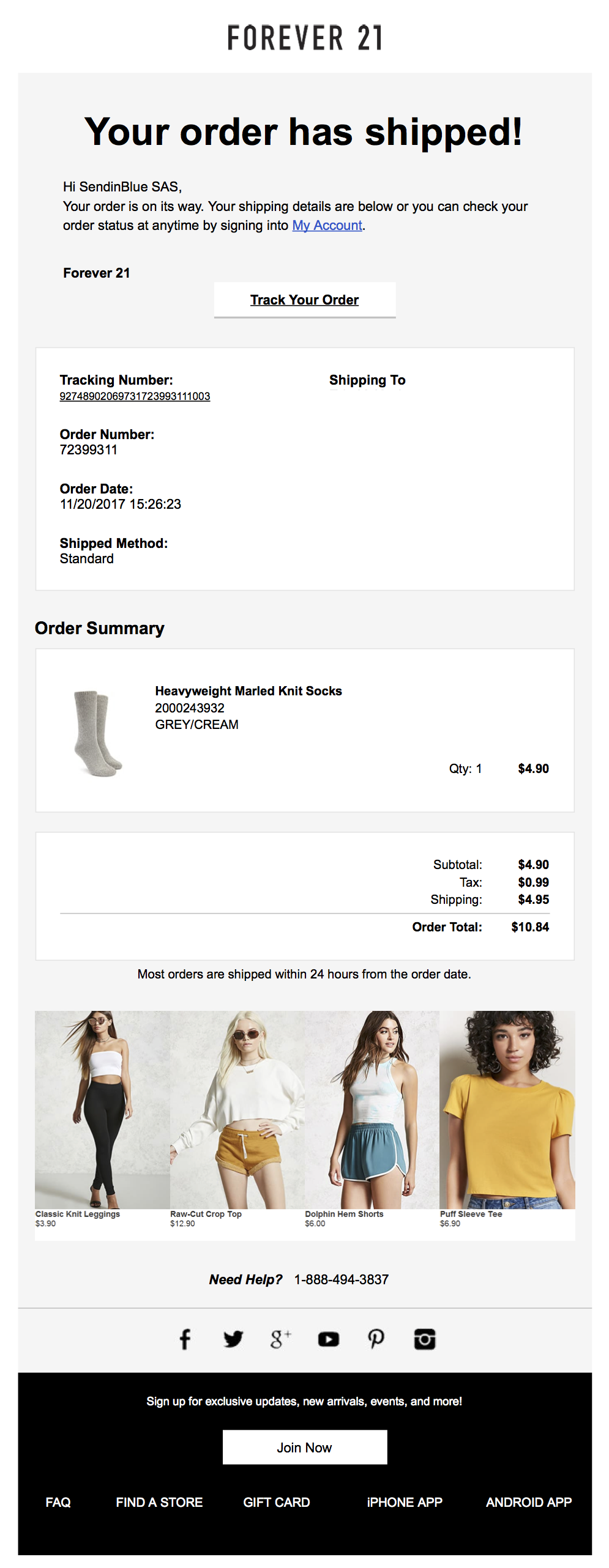
Forever 21
Forever 21’s design approach towards their transactional emails really appeals to me. Managing the white space on the email design, they are still able to organize important information readily viewable for customers.
They start off their transactional messages with an order confirmation.
Once the order has shipped, they follow up with the shipment details in a second email.
- Showcases other products that could complement the purchase
- Consistency in email template
The Bad
- No seasonal sale promotion
- Missed opportunity to promote loyalty program
Analysis and Lessons Learned
While the transactional portion of email marketing isn’t the most glamorous, having a simple but strong design works wonders.
Forever 21 knows this, as demonstrated by their additional product recommendations below the order details. These are an effective way to incentivize repeat business and tease customers on what other products they missed out on.
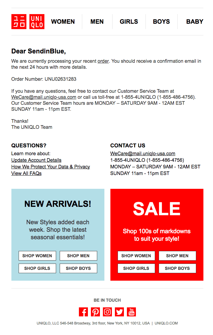
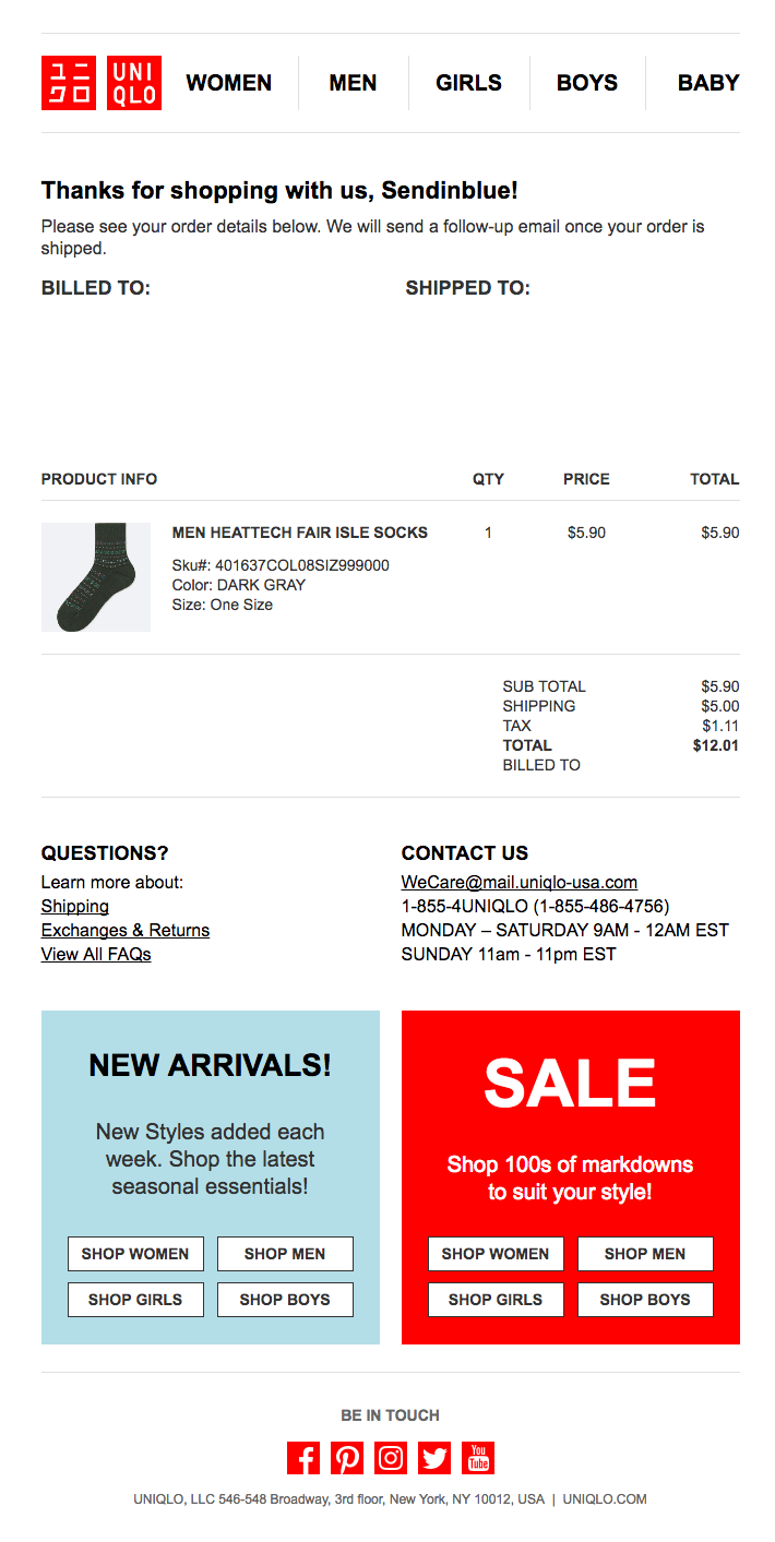
Uniqlo
Uniqlo’s transactional emails are more tell and less show. They take a more formal approach to the message, and stuck to their simplistic branding.
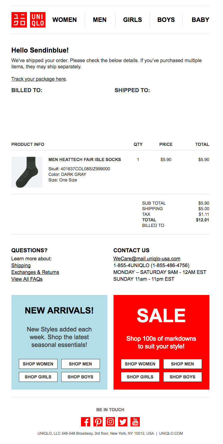
To start, Uniqlo customers receive a processing email that confirms the purchase details.
Next, customers are sent an actual order confirmation email when their order has been processed.
Finally, a shipping confirmation email is sent with the tracking number for their order once it has been sent out for delivery.
- Brand consistency across all transactional messages
- Contains all necessary information in a clear way
- Includes CTAs that showcase new arrivals as well as seasonal sales
- Relevant customer support information is included
The Bad
- No images make the email less engaging
- Too many emails might make customers annoyed
Analysis and Lessons Learned
Uniqlo’s transactional emails are effective at what they need to convey:
- Confirmation
- Price
- Tracking
- Customer support information
But, they missed an opportunity to create a more visually engaging email with images of products.
The CTAs at the bottom for new products and season sales are a great addition that can help drive traffic back to the store. But again, they would be more effective with specific and personalized products recommendations and images to showcase them.
Putting it all together
Hopefully, our analysis of these three awesome ecommerce brands has given you a better idea of what you can do to improve your email marketing engagement to build stronger relationships with your customers.
The takeaway lessons from these brands email campaign:
- Always have a clear goal with your emails
- Do your best to provide value and make your customers’ lives easier
- Be clear and forthright with your communications
- Personalize your messages for better engagement
Now it’s your turn to create effective emails that win over the hearts and minds of your customers!
If you want more content like this, subscribe to our newsletter below and follow us on Twitter!
 Deutsch


