 Deutsch
 EN
EN Español
 Français
 Italiano
 Português
Download our Google Sheets template and connect your Sendinblue account to create your own email marketing reporting dashboard to monitor and share the performance results of your email campaigns!
Using this email marketing report template, you’ll be able to:
- Import data directly from your Sendinblue account manually or automatically through Integromat.
- Monitor and compare performance between your different email campaigns with graphic visualizations.
- Easily share results with your team.
Create a copy of the dashboard file that you can update with your own information by clicking “File,” then choose the option “Make a copy.”
Using the email marketing dashboard template
To start using this dashboard, all you need to do is enter your campaign data into the “Data” tab of the spreadsheet. This data will automatically be processed to calculate comparative tables like:
- Open rates by subject line
- Bounce rates and complaint rate
- Engagement rate for each of your campaigns
Note: To replace the data currently populating the template, only delete the data located in the “Data” tab. If you erase data in the “Bonus – Integromat” tab, you risk erasing formulas that are essential for the report to function properly.
Automate your reporting with Integromat
To makes things easier, you can automatically import your campaign reporting data by syncing your Sendinblue account with Integromat.
To accomplish this, you will need:
- Our reporting spreadsheet template
- A Sendinblue account
- An Integromat account
Set up an Integromat scenario
Link your Sendinblue account and your Google Sheet with the help of Integromat.
Once you’ve downloaded our template, you will need to create an account with Integromat. Just fill out the form on their homepage and you’ll be good to go!
The onboarding tutorial should give you a good idea of how the platform works, but if you want to go straight to your scenario, you can also hit “Skip.”
Once you’re in the platform, go to the tab labeled “Template” and select Sendinblue and Google Sheets. From there, select the first option that allows you to save information about a specific campaign to a Google Sheet:
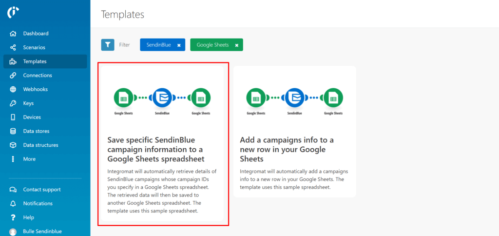
Then, click on “Create new scenario from template.”
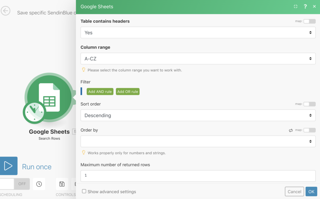
You will then be able to set up the different steps of your scenario:
- In “Connection,” link the Google account that you used to create the reporting spreadsheet.
- In “File,” choose your reporting spreadsheet document.
- In “Worksheet,” select “Bonus – Integromat.”
- In “Order By,” select “ID de campagne”
- In “Sort direction,” put “In ascending order.”
- You don’t need to fill out anything in for “Filtering.”
- In “Maximum number of returned rows,” put “1”
Your setup should hopefully look like this:
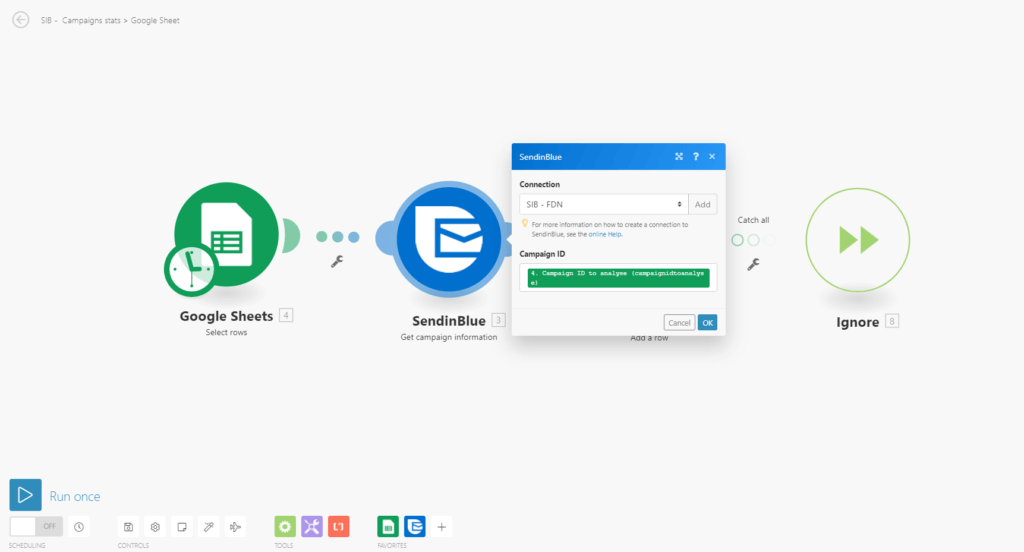
If it does, you can go ahead and click “ok,” then select the second circle with the Sendinblue logo.
This is the step where you configure the connection with your Sendinblue account. To do this, you will need to retrieve the API key from your Sendinblue account. Just log into Sendinblue and navigate to the “API & Forms” tab on the left menu. After you get the key and enter into Integromat, set the “Campaign ID” option to “Campaign ID to analyse.”
Now you just have to configure the data that is being added to your Google Sheet from Sendinblue, which can be done by clicking the final circle that has the Google Sheets logo inside:
- In “File,” choose your reporting document again.
- In Worksheet, select “Data” this time.
Now you just need to confirm everything and your scenario setup should be complete!
After finishing this step, you will need to configure the parameters for how frequently you want the scenario to update by clicking on the stopwatch icon. Select the option “Run once,” as this is all you need for the reporting template. If you have your scenario continue to run updates, it will add extra rows to your data tab that you don’t need.
Import data into your reporting template
Select the most relevant campaigns that you want to compare in your email marketing dashboard.
Importing data can be done in just a few simple steps:
- Before you do anything, erase all of the data that is currently being used as a placeholder in the “Data” tab of your email marketing report template.
- Choose which campaign you want to analyze.
- In your Google Sheets document, go to the “Bonus – Integromat” tab.
- Enter the campaign ID number of the campaign that you want to add in the “Campaign ID” field.
- Run your Integromat scenario by clicking on the blue button next to where it says “Run Once.”
- Your data should appear in the “Data” and “Bonus – Integromat” tabs.
- Import at least 5 different campaigns
- Return to the “Dashboard” tab of your email marketing report and analyze the performance data of your campaigns that now populate the graphs in your dashboard.
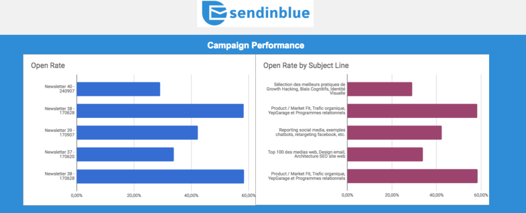
Email marketing KPIs
Essential metrics for comparing performance across different email marketing campaigns.
We included 6 tables on the dashboard tab that allow you to compare the performance of your email campaigns across 6 different KPIs:
- Open rate
- Open rate by subject line
- Click-to-open rate
- Click rate
- Complaint rate and bounce rate
- Unsubscribe rate
To learn more about each of these KPIs, check out our article on the 7 essential email marketing KPIs.
Change the appearance of your email marketing dashboard
How to increase or reduce the number of campaigns that you’re comparing in your dashboard.
To change the number of campaigns that you’re analyzing, double click on the first graph and select the “Data” tab. In the “Data Range” field, click on the “Select rows” option and adjust the final number to match the final rows containing the campaigns that you want to analyze in the graphs:

From there, you just have to follow the same steps for the other graphs and you should be good to go!
Conclusion
This reporting template allows you to easily compare the performance of your various email marketing campaigns and get insights into what’s working with your email marketing strategy, and what’s not. If you have more specific needs for your analysis, you can always adjust the graphs, formatting, or calculations accordingly. If you do, let us know about it on Twitter!
Don’t have a Sendinblue account yet? Sign up today to start sending up to 300 emails per day, absolutely free!


Comments
Thanks for the valuable post. How about starting mini-course on email marketing?
Tremendous things here. I am very happy to peer your article.
Thank you a lot and I am looking forward to contact you.
Will you please drop me a e-mail?