Deutsch
 EN
EN Español
 Français
 Italiano
 Português
Transactional email design is one of the most overlooked aspects of email marketing, but it can have a massive impact in your revenue and customer engagement!
Many companies fail to pay enough attention to their transactional emails. This is because transactional emails often serve a utilitarian purpose, making it easy to forget about the marketing opportunities that these messages present. But contrary to popular belief, transactional emails don’t have to be boring! Overlooking this crucial opportunity to connect with consumers is a big mistake!
Because recipients are expecting them and actively seeking the information they contain, transactional emails often see much higher engagement.
Commonly used transactional emails like:
- Newsletter signup verifications
- Order confirmations
- Order shipment notifications
- Password resets
- Reservation confirmations
- App signup verifications
- Receipts
Provide opportunities to let your brand voice shine and appeal to customers and subscribers. Well-designed transactional emails that provide helpful in-email content, as well as drive traffic back to the main site, are always a winning combination.
Check out these examples of exceptional transactional email design to provide inspiration for your own emails:
1. Consistent Branding
As a brand, Airbnb embodies a sense of homey and personable adventure for travelers. Their use of pink color and soft, casual font in their logo and site gives a fun and relaxed impression. Additionally, their reliance on beautiful imagery gets people excited about exploring new places and having new experiences. Airbnb’s transactional images convey consistent branding to carry this feeling through all their email communications.

This reservation confirmation email uses the same colors as their website and app, to immediately set recipients at ease, but it doesn’t stop there. The use of maps and images to introduce the space and the host provides a fun, friendly, homey feel that gets renters excited about their upcoming trip. Sure, it conveys important details related to house rules, cancellation policies, fees, and other critical rental information, but the email doesn’t let that “boring stuff” drag down its overall feel.
The result is an email that has a purpose! It not only acts as a receipt and legal notification, but it also sells the brand.
By advertising the option to become a host, Airbnb takes this transactional email to a whole new level. They’re using an email designed for one side of their business (attracting renters) to build the other side of their business (finding hosts), fueling business objectives and solidifying their leadership in the industry.
2. Increases Website Traffic
Dollar Shave Club has a subscription box service, which allows customers to get the products they use most often delivered to them directly every month. However, instead of simply emailing subscribers to notify them that their box has shipped, Dollar Shave Club makes smart use of their automated transactional emails by emailing customers before the box ships to give them the opportunity to add items to their order.

This upsell strategy is becoming more popular among retailers because not only does it increase average order value, but it also expertly directs traffic back to the site. Displaying products that are customized to subscribers’ preferences increases the likelihood that they’ll click-through to the site to shop more and take other desirable actions like leaving a review, sending a gift box, or subscribing on social media. The result is increased conversions across the board for a variety of business objectives.
3. Includes Supplementary Information
Hyatt House’s reservation confirmation email is a great example of a transactional email that includes more than just basic information.
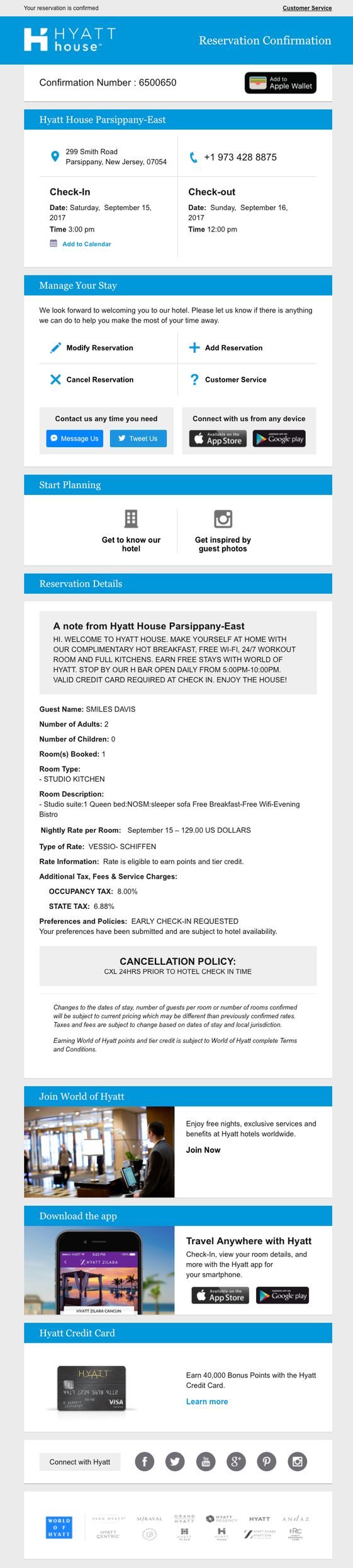
While it certainly has relevant reservation information like a confirmation number, check-in and check-out details, and room details, it also includes other corporate resources. By plugging into the wider Hyatt network, the email is able to feature World of Hyatt rewards information, an app download prompt, and a Hyatt credit card offer. It also shrewdly includes user-generated content from social media to give soon-to-be guests an insider glimpse of the property and links to Hyatt’s own vast array of social media profiles across today’s most popular platforms. As a result, travelers can feel confident with their reservation while simultaneously plugging into Hyatt’s juggernaut of rewarding features.
Encouraging guests to take additional actions like download an app or sign up for a credit card paves the way for greater brand recognition and preference for future travels, fueling long-term business growth.
4. Good Use of Color
If there’s one company that knows how to market their products, it’s Apple! And Apple’s iCloud signup confirmation email is no exception.

This email could have simply informed the user that their signup was successful with a one-liner. However, Apple uses this opportunity to introduce subscribers to their service and tout its benefits in a way that makes them excited about getting started and provides real value.
Acting as both a tutorial and expert-grade marketing collateral, the email covers the basics related to document and photo storage, sharing capabilities, phone location services, and notes. While the information itself is plainly presented, the use of images results in a wonderful use of color.
The imagery is eye-catching to excite subscribers and provide an example of what they can expect to see on their own device when using iCloud to its full capabilities. These images pop against a stark background to stand out in a way that’s not overwhelming and supplements the text nicely. The resulting whitespace gives the email a nice balance to avoid feeling cluttered.
5. Simplistic Design
The shortest and simplest email in this lineup is from Kickstarter. This transactional receipt email is sent to supporters once they’ve helped fund a project.

By simply including pledge details and information from the project organizer, Kickstarter creates a straight-forward email that gives backers exactly what they want. Some praise and gratitude coupled with a social media plug are all this email needs to achieve its objective of conveying important information and encouraging additional funding.
Unlike many of the other email examples we’ve outlined, Kickstarter opts for a simple design to let backers know that they value their time and aren’t going to send them anything that they didn’t ask for and don’t want. This strategy can be very effective if, like Kickstarter, customers’ interactions with your business are highly transactional in nature and don’t need a lot of ongoing nurturing.
If you want more email marketing tips, subscribe to our newsletter in the sidebar at the top of the page!