 Deutsch
 EN
EN Español
 Français
 Italiano
 Português
Looking for transactional email inspiration? We put together a list of 8 transactional email examples that will help you create messages that will leverage this valuable real estate to its fullest extent!
Transactional emails are an incredibly important aspect of email marketing. However, they’re also the most underrated and underutilized element!
Many companies treat transactional emails like obligations instead of opportunities. The result is an inconsistent email strategy where promotional emails get all the attention and transactional emails are largely an after-thought. This creates a brand discrepancy among communications and wastes a valuable opportunity to engage customers.
This is even more prevalent in small businesses where employees may lack the time or skills needed to create well-designed transactional emails. However, the right email marketing platform can make crafting branded transactional emails super easy. But before that, you have to understand the underlying strategies behind these emails first.
Generic transactional emails are all too common today — but this doesn’t have to be the case. They have the potential to ooze personality and excitement just like their promotional email cousins. In fact, transactional emails can do as much (if not more) to drive conversions and create loyal followers and customers!
Check out these excellent transactional email examples for ideas on how to improve your customer relationships through all of your messages:
1. Abandoned Shopping Cart Email
What this email gets right:
- On-brand
- Eye-catching
- Includes a discount offer
- Promotes related products
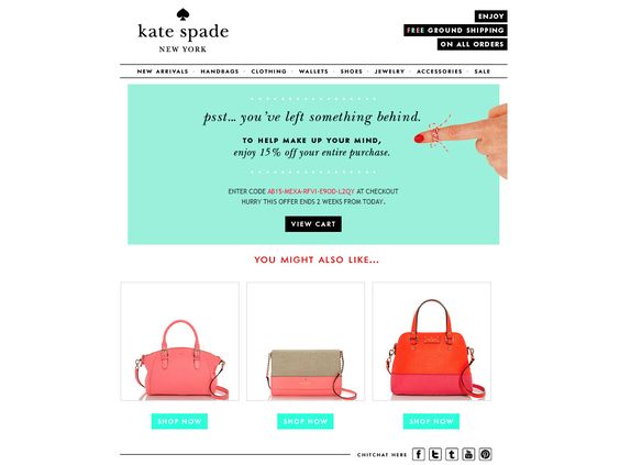
This playful abandoned shopping cart email from Kate Spade not only reminds shoppers that they haven’t finished checking out but also entices them to come back for more.
By offering a discount and suggesting products in related colors and styles, it addresses any concerns about not being able to find the right product and increases the likelihood winning back this lost purchase.
Adding a free shipping offer is another really great example of addressing customers’ biggest concerns and sweetening the deal. The use of the phrase “Enjoy free ground shipping” makes the offer seem indulgent instead of just routine.
The email is on-brand, mimicking the layout of the Kate Spade website, which creates a seamless brand experience and helps establish a deeper level of trust. Like the website, it aims to cross-promote other shopping categories like clothing, jewelry, and shoes, while also encouraging social interaction with the brand.
A transactional email like this certainly stands out in an inbox because of its bright crisp colors and careful balance of text and white space.
2. Welcome Email
What this email gets right:
- Evokes excitement
- Includes value propositions
- Encourages immediate shopping
- Provides additional avenues to connect
- Good balance of images and text
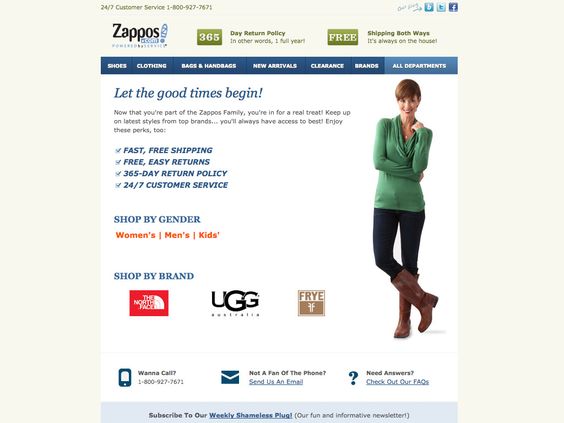
How much different is this message than your standard, dry “Thank you for signing up” welcome email? Zappos knows how important that first interaction is with new subscribers, and they use their signup confirmation email to capitalize on this golden opportunity.
From the very first line, this transactional email gets the new subscriber excited to receive more emails. It reassures subscribers that they made a good decision to sign up and touts the benefits that they’ll receive when they become a customer.
Value propositions like “Free, easy returns” and “365-day return policy” aim to not only sell shoes, but also reduce purchase anxiety, which is why they’re an excellent fit for new subscribers who may not yet be sold on the idea of buying footwear online.
The email then goes a step further and encourages shopping right away by linking to gender-specific footwear and top-selling brands. By featuring an image of someone wearing cool boots and including links to start the shopping journey, Zappos is letting subscribers know that they can get fashionable footwear that they’ll feel good about buying and wearing.
Using casual conversational language like “Wanna call?”, they conclude the email with a friendly offer to help via their contact channels. This final touch rounds out the transactional email by providing everything that a new subscriber would want in their first interaction with a brand.
3. Double Opt-In
What this email gets right:
- Simple, easy to understand message
- Clear call-to-action (CTA)
- Incentivizes the sign-up
- On-brand
Using a double opt-in strategy is always a fantastic idea — especially with the upcoming European GDPR legislation going into effect in just a few months.
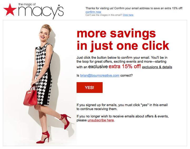
Macy’s sends their double opt-in email with flair by using branded colors and images. The message contained inside is simple and straight-forward, offering new subscribers a way to get out right away if they’re already regretting the decision to sign up.
By offering a discount at signup Macy’s is setting the expectation that subscribers will be entitled to these types of benefits moving forward if they opt-into emails. They’re also effectively leveraging this high-intent time — right after subscribers decide that your emails are worth receiving — to drive traffic to their store and encourage a purchase. This is a wonderful way to make sure recipients engage with future emails down the road.
4. Order Confirmation
What this email gets right:
- Upsells
- Visually appealing
- Links to fun co-brand information to encourage click-throughs
- Includes helpful resources
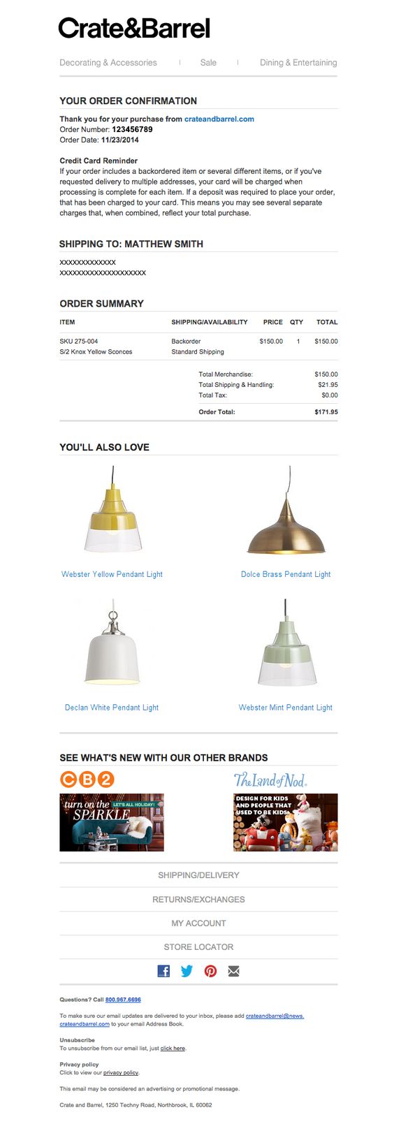
Crate & Barrel’s order confirmation email contains important information like an order number, credit card charge reminder, shipping address, and order summary, but it doesn’t stop there! It also includes a gallery of related products aimed at upselling the customer on complementary items. This visually appealing component adds a pop of color and encourages the recipient to read on further in the email for more promotional content.
In a shrewd move, Crate & Barrel also includes content from their other brands to promote broader brand awareness and encourage click-throughs. Including images as buttons adds to the aesthetic element of the email, making it as aesthetically attractive as it is functional.
Additionally, the email contains links to helpful resources for shoppers related to shipping, delivery, returns, and so on. This reassures shoppers that Crate & Barrel is committed to their satisfaction. Including these links all in one place also increases the importance of this email, making it the type of transactional email that recipients will hold onto even after receiving their products to reference later.
5. Order Shipping Confirmation
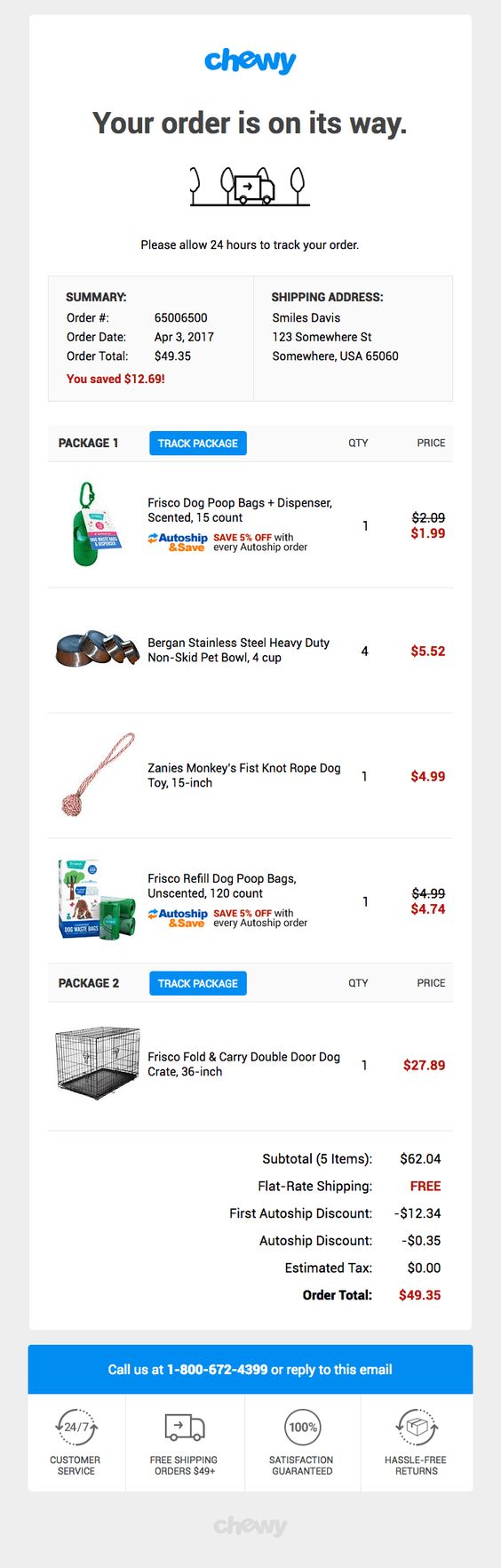
What this email gets right:
- On-brand
- Clean and simple
- Uses a strong call-to-action (CTA)
- Includes value propositions
It’s a small detail, but the doodle at the beginning of Chewy’s shipping confirmation email both establishes expectations and rings true to the brand persona. This tiny addition makes the email seem fun and friendly from the beginning, setting the tone for the rest of the email.
Much like the order confirmation email from Crate & Barrel, this email also contains crucial information like an order number, total, and shipping address, but it goes a step further by making this content visually appealing. By inserting images for each item purchased instead of just the product names, it builds excitement over receiving the products and serves as a good reminder.
A big eye-catching blue bar reminds the customer that he/she can simply call or reply to the email with any questions or issues. This strong CTA eliminates the need for the recipient to search through microscopic footer links or click through to an FAQ to get help, which can go a long way in building that trust between your customers and your business.
Finally, the email concludes with a reiteration of Chewy’s brand promises and value propositions to reiterate to customers that they made the right choice for their pet needs.
6. Password Reset
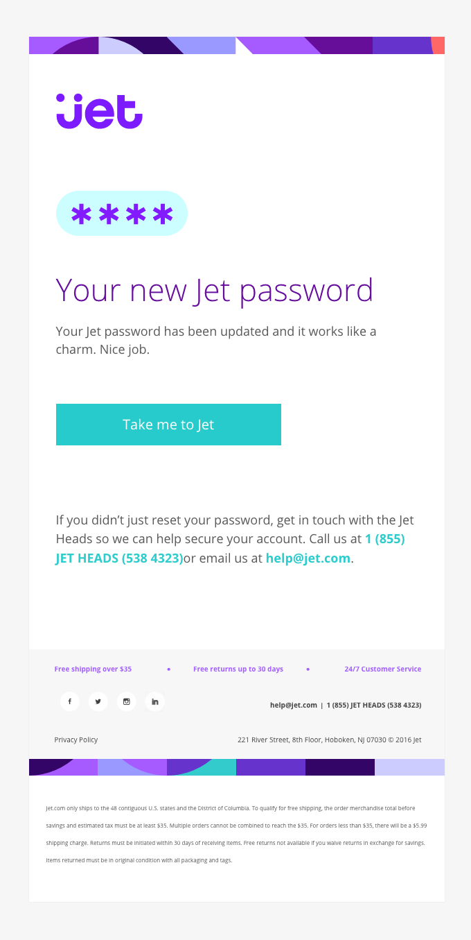
What this email gets right:
- Playful
- On-brand
Most companies wouldn’t view a password reset email as a chance to do anything other than inform a user that his/her password has changed. But Jet understands that this transactional email is one piece in a bigger puzzle of opportunities to let their brand shine, which is why the email uses brand colors and a layout akin to their website.
They turn this normally boring email into something feel-good and worth reading by including the phrase “Your Jet password has been reset and it works like a charm. Good job.” Those two little sentences make a huge difference in setting the tone for the email and makes the Jet brand more endearing to recipients.
7. App Download Prompt
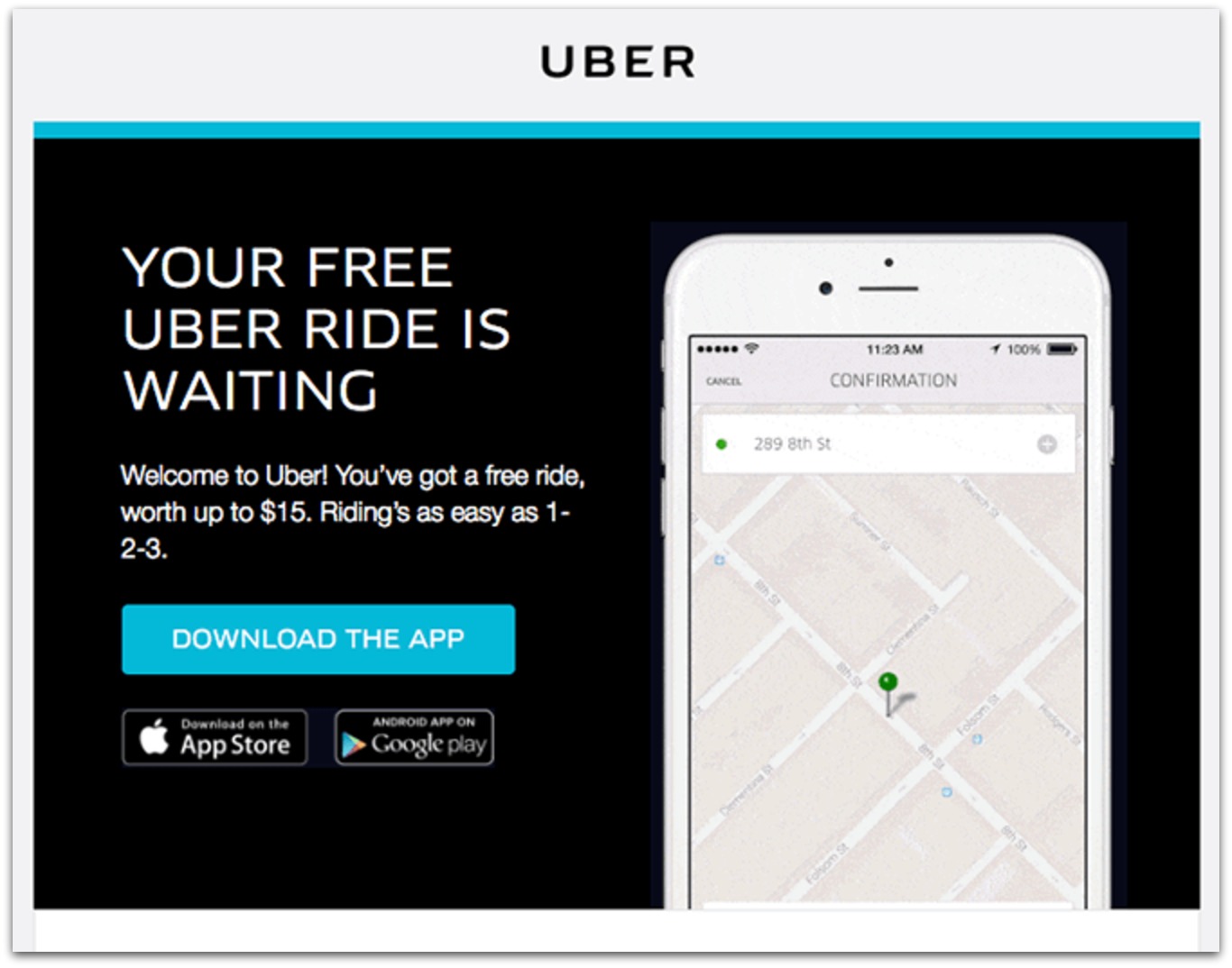
What this email gets right:
- Simple and clean
- Contains a promotional incentive
- Clear call-to-action (CTA)
Obviously, for a company like Uber, downloading the mobile app is essential. However, companies offering an app download to complement their regular web-based experience can learn a lot from this transactional email from Uber.
It’s simple, clean, and uses a small amount of text to get the job done. It omits anything that would clutter the email and only conveys essential information in a way that’s very easy to understand. The CTA button stands out and makes it easy for recipients to understand that their next step should be to download the app.
Additionally, it makes an introductory offer to incentivize the download, which is often necessary to convince customers to take up more space on their phones with yet another app.
8. Special Action Required
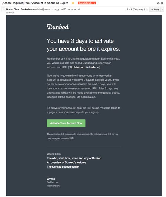
What this email gets right:
- Disarming
- Engaging
- Clear call-to-action (CTA)
- Demonstrates authority
Depending on the nature of your business, you may have specific needs that necessitate additional transactional emails, such as notifications or important updates that require action from customers.
For Dunked, they allowed users to reserve URLs before their service was live, but then needed users to confirm that they wanted to keep those URLs by signing up for service after the site had officially launched for business. To do this, they sent a very smart transactional email that reminded subscribers who they were and why they should stick around now that Dunked had launched.
It was very plausible that users may have received this email after not having heard much from Dunked and been alarmed about some strange company getting their email address. To combat this concern, the email reminds recipients what Dunked is and why they’re getting an email now. It then goes on to provide clear instructions on what to do next.
Furthermore, it establishes authority by including links to helpful resources to learn more about Dunked. The signature makes clear that this communication is coming from one of the founders instead of some entry-level customer service employee or a generic corporate email box. The result is an email that is equal parts disarming, engaging, and persuasive.
If you want more content like this, subscribe to our newsletter or follow us on Twitter!


Comments
Hey Jeff,
I apologize if you are not the right one for answering my question :
I am used to send emails every week to our members with the new sendinblue language and it doesn’t work with the “if” using (result is wrong). With the previous language it was working …
Thank you for your help.
Pierre
Cher(e) {{ contact.PRENOM }} {{ contact.NOM }},
Votre dernière adhésion date du {{ contact.DATE_ADHESION }}.
Votre adhésion est {% if contact.DATE_ADHESION >= NOW(-365) %}en cours{% else %}dépassée{% endif %}.
{% if contact.DATE_ADHESION <= NOW(-366) %}Pensez à la prendre ou à la renouveler (5€ pour un an) !{% endif %}
Avoir ou Dette actuelle (compte client) : {{ contact.AVOIR | floatformat: 2 }} €.
Attention ! La dette éventuelle tient compte des commandes en cours non réglées !
Bien amicalement.
La MCE
Hi Pierre,
Can you please send an email with your query and campaign ID to contact@sendinblue.com so that we can take a closer look? Your query will be assigned to the French speaking team. Thanks! Emma