 Deutsch
 EN
EN Español
 Français
 Italiano
 Português
Following call-to-action best practices in your email marketing and newsletters will help you generate more engagement and sales in your marketing campaigns.
When you’re creating an email campaign, designing a transactional email for your eCommerce store, or setting up a new landing page on your site, one of the most important things to focus on is your call-to-action (CTA).
CTAs are the heart of digital marketing. It’s the biggest factor in determining your ability to achieve the goal that you wanted with your email. A strong CTA tells consumers what to do next – controlling traffic flow and driving conversions. Effective CTAs encourage conversions like purchases, downloads, sign-ups, video views, RSVPs, donations, and social media follows.
But unlike website versions, email CTAs have the added job of needing to incentivize subscribers to leave the safe confines of their email inboxes to visit a company’s main website or social media profile. This can be a big ask for new subscribers or less engaged recipients who might not be ready to put in that extra effort just yet.
Strong calls-to-action can help you overcome this customer hesitation by giving the reader something they absolutely cannot ignore.
This isn’t an easy task, but luckily we have some tips to help you out! If you’re looking to maximize your email conversion potential, make sure you follow these call-to-action best practices:
1. Choose the Right Placement
The most effective email call to action buttons are located above the fold in a prominent location. Whether recipients are viewing an email on a desktop, laptop, or mobile device, positioning the CTA above the fold is the best way to ensure that they’ll see it. Additionally, placing it near an image or other eye-catching design element increases the likelihood that it will pop out to subscribers to receive more clicks.
Ally does an excellent job with this by putting their “Learn More” CTA above the fold and next to an image of their shiny new credit card option. Subscribers are presented with a brief message and exciting image, and then immediately hit with the CTA.
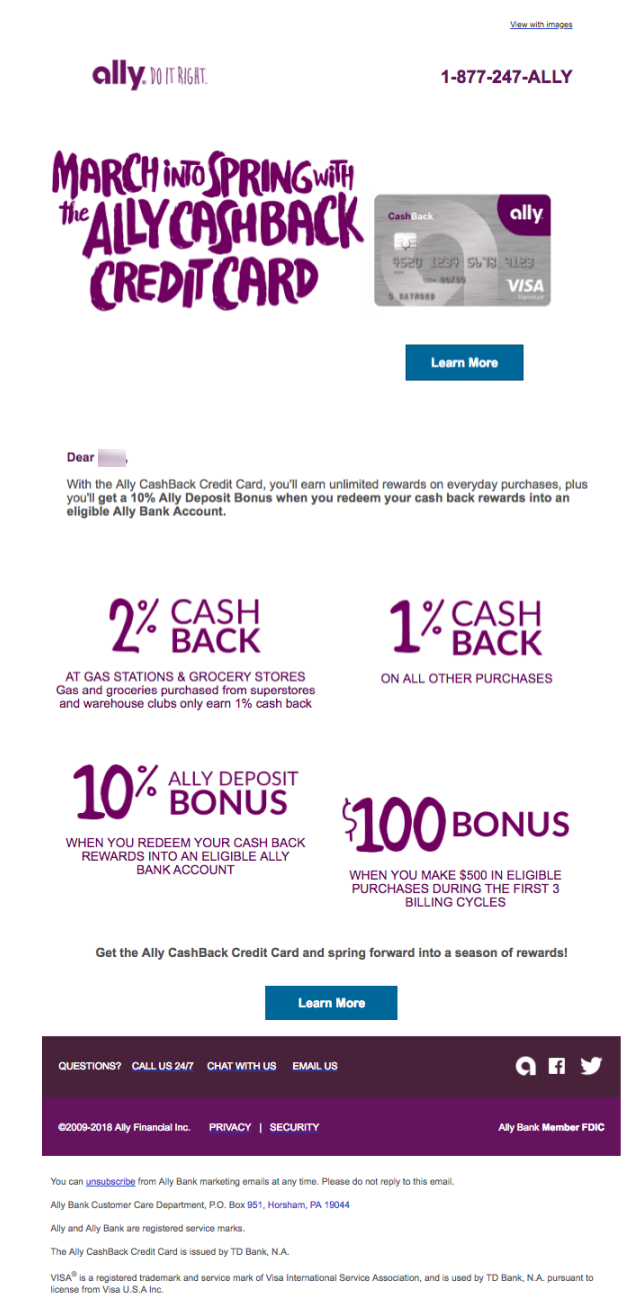
Recipients that want more information before clicking-through to Ally’s website have the option to scroll down for more details on bonus incentives and rates with the same CTA reiterated at the bottom.
By using a plain, easy-to-read font on a different colored button, the CTA stands out throughout the email in a way that’s likely to drive engagement.
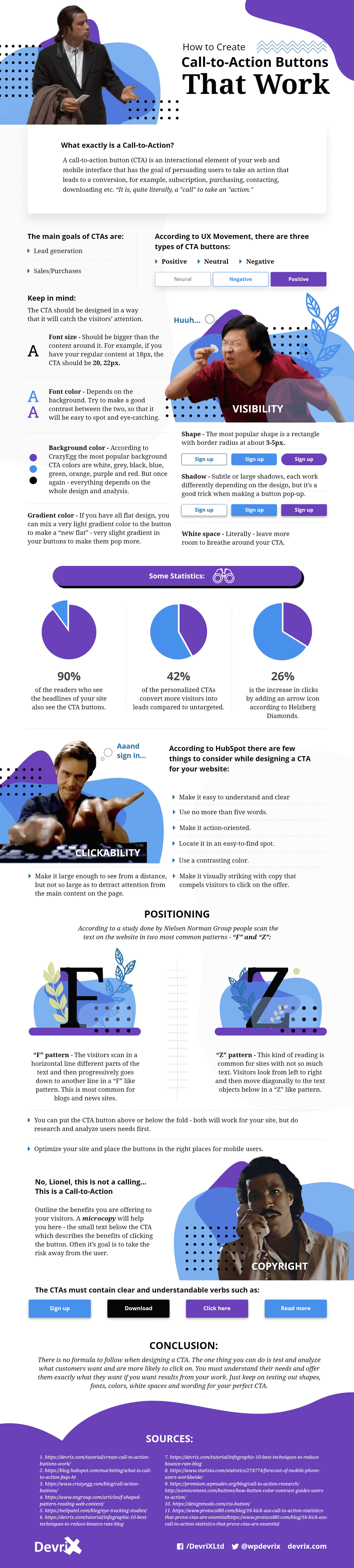
This infographic from Devrix does a great job explaining best practices for call-to-action buttons:
2. Use Action-Oriented Words
While many companies choose to stick with the standard “Read More” or “Learn More” CTAs, others find success using juicier action-oriented language like “Get Exclusive Tips,” “Try for Free,” or “Sign me Up.” This varied verbiage resonates well with recipients because it’s exciting, unusual, and now-focused.
Carter’s implements this approach by infusing their emails with lots of action-oriented calls to action to encourage recipients to shop online or in-store.
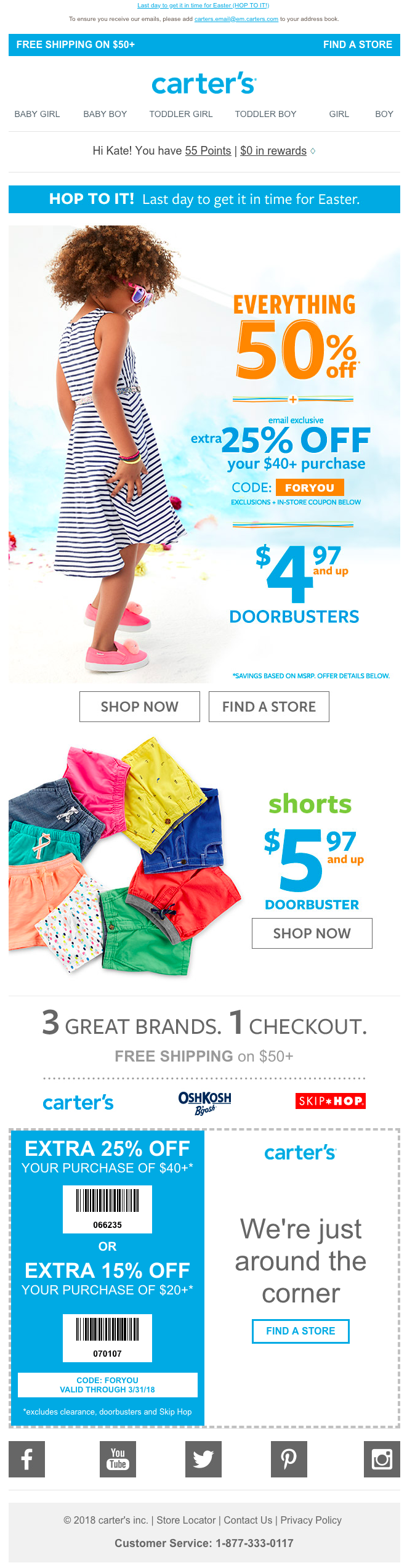
More common CTAs like “Shop Now” and “Find a Store” are paired with the non-traditional phrase “Hop To It!” to give the overall email call to action a strong, actionable feel. These CTAs are repeated throughout the email alongside value propositions related to value and style to excite recipients about shopping.
3. Create a Sense of Urgency
If an offer is time-sensitive or a product has scarce inventory, always inform recipients. This creates a sense of urgency to drive immediate action and also provides transparency. The last thing you want is to turn subscribers and customers off by promoting an offer that they cannot take advantage of any longer.
Red Robin creates urgency expertly with their “Tavern Double Tuesday” emails.
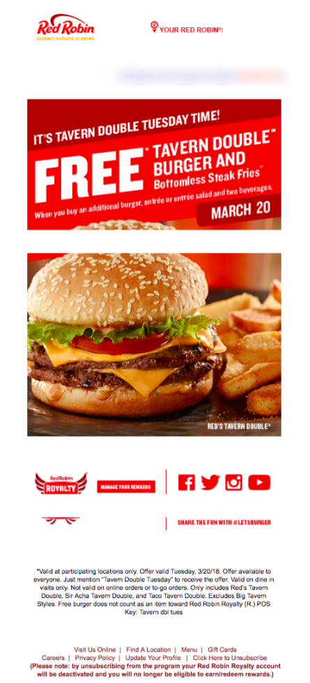
They hit subscribers over the head with the idea that their free burger is a limited-time offer using time-focused language. Using the day of the week as well as the date while presenting the offer reiterates that it is a single-day offer only.
This information is conveyed above the fold (making it even more prominent than the delicious burger image) along with the stipulations for the offer, which provides immediate clarity for subscribers who are unfamiliar with the promotion.
4. Make an Exclusive Promotional Offer
Most people subscribe to emails to receive promotional offers, which is why they’re a great addition to any CTA. Incentivize recipients to click-through using an exclusive offer that promises real value.
Pizza Hut uses this approach in all their emails by extending offers to subscribers for free menu items and discounts on order totals.
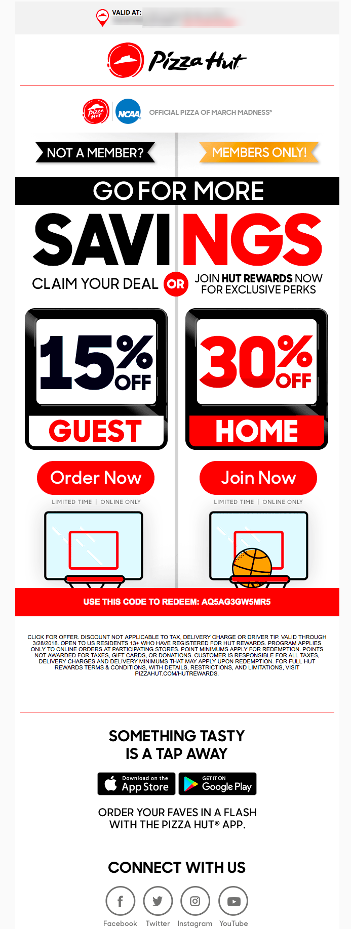
In this email, Pizza Hut takes the concept of offering a special discount a step further by not only enticing subscribers to make a purchase, but also incentivizing them to become Hut Rewards members.
Presenting a guest offer and member offer side-by-side informs non-members of the benefits they can attain by becoming members, and simultaneously makes members feel valued by giving them a greater discount.
5. Use the Right Colors
Color psychology is a huge topic in marketing and web design! Ashton Hauff explains, “In an ocean of content marketing, color can help your [marketing] stand out. It’s what gets your audience to see what you want them to see, feel what you want them to feel, and to do what you want them to do…
However, poor color choice can also negatively change the impact of your message. Get it wrong, and your great content and your amazing call to action will be easily ignored.” Using the right colors in your marketing is of paramount importance, and it’s one of the most essential email call to action best practices as well.
Colors must be carefully selected and effectively juxtaposed to draw attention to CTAs and encourage engagement. CTAs that don’t stand out amongst other text and background colors or images will fail.
Chick Fil-A uses color wisely in all their marketing by having a logo that simply and intentionally uses a single color to make a statement. While red is well-known for being a hunger-driven color, Chick Fil-A’s #E51636 is a specific shade of red that adorns their printed and web materials to provide a recognizable mark across all customer touch-points.
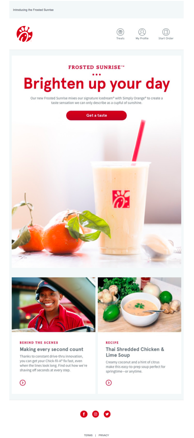
They use this same red for their CTAs and most important text to tie back to the brand and provide a pop of color in what is otherwise a fairly simple email design.
Using their signature red color to announce a new product and carrying that through to their “Brighten up your day” and “Get a taste” CTAs excites subscribers while keeping brand consistency. Additionally, contrasting vibrant red CTAs with soft and cozy images that contain orange, green, and cream colors aids in further highlighting them.
Now that you have a better sense of how you can make your email objectives clearer for your readers and all of the other email call to action best practices to stand out, it’s time to start supercharging your own email campaigns!
If you want more email marketing tips, subscribe to our newsletter at the top of the right-hand sidebar!


Comments
Thanks for sharing such a nice Social Media Marketing blog.