 Deutsch
 EN
EN Español
 Français
 Italiano
 Português
So you launched your blog, created all kinds of fancy ways for your readers to subscribe to your email list, AND…
Crickets.
It’s frustrating to spend time on making sure you have all the right calls to action (CTA) but receive no response.
After all, the only reason you have email subscription forms in the first place is so that users will sign up for your email list.
So, what gives?
Unfortunately, this is not an uncommon scenario. It doesn’t take much for an email newsletter subscription form to become a metaphorical stinkbomb that sends your readers running.
There are tons of common mistakes that marketers make in their email list building strategy, and making just one of them can be enough to drive potential subscribers away.
In this article, I am going to talk about the 6 most common mistakes that marketers make when trying to build their email list with on-site email subscription forms.
Oh, and I’ll give you tips on how you can prevent yourself from making these mistakes too!
7 Email Newsletter Signup Form Mistakes to Avoid
1. Timing your email signup form poorly
One of the absolute worst things you can do when setting up an email signup form is having them show up at the wrong time.
Picture this.
You just found a link to the perfect article that promises to answer all of the questions you have in life (or maybe it’s just an interesting-sounding marketing post).
You click through, and… instead of the article, you get this:
At this point, you might be so frustrated that you forgot why you even came to the site in the first place. Or, more likely, the site has lost an enormous amount of credibility because they solicit you for your email address before you even see their content.
A subscription form like this is pointless if you are really trying to build your list.
To illustrate this point, consider the Psych’d framework that was created by Darius Contractor.
Although Contractor created this framework to analyze full funnel conversions, the same principles can be applied to converting readers into email subscribers.
Essentially, Contractor states that users have a certain amount of “Psych,” when they enter your site. Every single thing on your site can either add or take away Psych.
Things that add Psych include endorsements from other trusted sources or content that directly addresses their pain points.
Things that take away Psych include “salesy” and inauthentic CTAs or excessive form fields.
In order for someone to convert, their Psych level has to remain positive, or else their interest will be too low to stick around.
Basically, you want to avoid taking away Psych from your readers by overwhelming them or coming off as inauthentic.
So, if you are coming to a site and the first thing you see is a salesy email signup form, you are probably not going to sign up for their newsletter. You may not even continue on to read the original post.
How to avoid this mistake:Give your readers some time to actually read your content and see the value that you’re providing before asking them to subscribe.
After they see the value in your content, they will be much more likely to subscribe.
2. Including too many CTAs on your site
You know the classic saying, “like a kid in a candy shop?”
It’s usually used to describe the excitement you feel when you’re trying something new.
I’m pretty sure the saying should be modernized to say, “like a marketer with a new software tool.”
When we get new tools, we naturally want to try out all of the features.
After all, we aren’t paying for the tool just so we can use one piece of it. That’s like buying a pizza and throwing it away after only eating two slices!
But, when creating CTAs for your website, it is important to find a balance that doesn’t overwhelm your customers.
The best way to do this is to have clear goals for your CTAs and not have them overlap too much with each other.
If you have a subscription form for gated content, a slide-in to sign up for the newsletter, and a generic popup to drive users to your main site all on one page, your readers aren’t going to be happy.
It is okay to have some CTAs that link to other pieces of content or your main site along with an email subscription form popup, but everything is better in moderation.
How to avoid this mistake:As I mentioned above, this one just requires moderation. Don’t overload your page with superfluous CTAs that are all designed to do the same thing.
Even if they have different purposes, make sure that your CTAs are spread far enough apart to prevent them from being disruptive.
When in doubt, I would follow these guidelines:
- Find the right mix of CTAs that keeps users on the page and maximizes subscriptions. This can be done through A/B testing, or just recording results of different combinations until you find the sweet spot.
- Don’t confuse your readers with multiple different calls to action that have an email signup form. This might give the reader the impression that they are signing up for different email lists depending on the form they fill out (unless that is actually true, in which case you should make that very clear).
- Diversify the goals of your on-site CTAs. You can have links redirecting readers to relevant content or pages, but don’t let them take away from the value from the content on the page.
3. Not making your CTA immediately relevant to the page content
In addition to overwhelming readers with too many popup, slide-in, overlay, and in-line calls to action, many sites also make the mistake of having subscription forms with messages that are unrelated to the content on the page.
Usually, this applies to websites on which content addresses multiple different topics.
If you want to see best practices, check out our 20 Newsletter Signup Examples to Take Inspiration From
Many sites like this create a generic subscription CTA that appears on every page regardless of content.
While these unrelated offerings or CTAs might convert get some readers to sign up, it’s not the best strategy for attracting new subscribers.
How to avoid this mistake:If your blog contains content on multiple categories, make sure to diversify the messages that go along with the email signup form to relate to the category being discussed in the content.
For example: instead of saying “Get the latest marketing news” for the call to action on a post about marketing automation software, relate it back to the topic with something like, “Get the latest tips and insights on marketing automation!”
In doing this, you are demonstrating that your newsletter is an extension of the content in which the reader already has an interest.
4. Failing to offer immediate value with your email newsletter signup
Another common mistake is having only generalized offers in the CTAs of your email subscription forms.
If all of your CTAs asking people to sign up for your newsletter are generic statements like, “Join 10,000 other readers by subscribing to my newsletter,” you’re not getting the most from your readers.
In order to give up an email address, readers want to know that they are getting something that they really want in return.
Without a tangible value proposition, it’s gonna be a hard sell to get people to sign up for your list
How to avoid this mistake:The more tangible you can make your offer, the better your results will be.
As a matter of fact, offering a real resource (such as an e-book) can increase conversion rate on email signup forms by 100%.
Even if it is not a gated piece of content, you should try to clearly state the value your users will get from subscribing to your newsletter.
For example, “Sign up for our monthly marketing newsletter for content that’s guaranteed to help you take your career to the next level!” sounds a lot better than “Subscribe to receive more of my articles!”
So, when possible, keep your offer tangible and your value proposition clear.
5. Requiring too much information to subscribe to your newsletter
Most users don’t like to give up personal information in order to subscribe to a newsletter.
Usually, this is due to privacy concerns.
Or, if my feelings are any indication of a broader trend, it may just be due to laziness in filling out multiple forms on a website.
Whatever the reason, many sites make the mistake of asking for too much information from readers in order to subscribe to their blog.
Their CTAs end up looking like this:
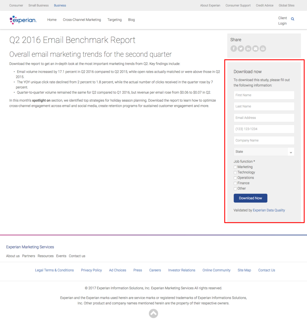
This drastically reduces the likelihood that someone is going to go through all of the trouble to actually complete the subscription process (remember the Psych’d framework).
So, you should try your best to stay clear of adding more friction to the subscription process.
How to avoid this mistake:Minimize the number form fields in your email subscription CTAs.
Ask yourself, “what do I really need to know about my readers before they sign up?” Usually it’s just an email address (and maybe their first name to reference in email salutations).
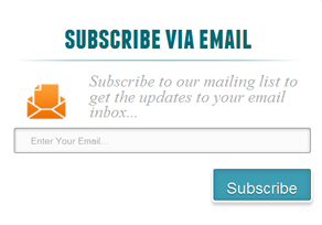
6. Using a bad color scheme
Colors can have a lot more influence over people than you think.
Different colors are associated with different emotions, and these emotions can have a direct effect on how people behave.
Colors can also form a strong association with your brand.
Using a color scheme that isn’t consistent with your brand or complementary with itself can have a negative impact on the perception of your business. This will drive users away from subscribing to your newsletter.
How to avoid this mistake:Don’t be careless in your color strategy. Every choice that you make is going to have an effect on your readers’ decisions.
The colors on your subscription form CTAs should not be a distraction. Use color to highlight exactly what you want the reader to do:
- Read the offer
- Type in their email address
- Click submit
When used correctly, color can be a powerful tool that increases the conversion rate of your CTAs.
Time to start building your list!
Now that you have a better idea of some the things you should avoid when implementing an on-site list-building strategy, you can optimize your CTAs for the best possible results.
Have you seen other mistakes that websites make with email subscription forms?
Share them with us in the comments below!
Check out these additional articles:


Comments
Your given tips were amazing. They are very helpful for beginner marketers.